Showing posts with label colour charts. Show all posts

Monday, 11 January 2016

The Artistic Process

Sketchbook studies in watercolour of green fern leaf by Shevaun Doherty
Blechnum gibbum studies © Shevaun Doherty
“Love the process and the painting will happen”

A friend once remarked that being a botanical artist is as much about loving the artistic process as it is about the painting. 
It’s true. I get a huge amount of pleasure out of creating study sheets and colour charts, chasing a leaf or flower across a sketchbook page, each time tweaking the colour mixes until it’s just right.

Artist desk with colour charts and watercolour studies of a leaf

Although there is an element of play in this, the notes that I make are also extremely useful. I’m constantly pulling out old sketchbook studies to find out what colour mixes I used to get a particular shade of green, or how to achieve a particular texture.

Watercolour study of Limonium sinuatum by Shevaun Doherty
Limonium sinuatum colour notes
Sketchbooks and study notes help me explain my process to other artists, particularly those who are just starting their own botanical art journey. I think it’s a bit of a relief for them to see the messy bits and the occasional crises of confidence (help! I’ve forgotten how to paint) !

Sketchbook page of pelargonium flowers with colour notes by Shevaun Doherty
It doesn't always work out, but making mistakes is part of the process
Very often our focus is on the destination and not on the journey, and that can lead to a creative block. It’s important to stop worrying about the finished painting, that ominous blank sheet of paper, and just enjoy the creative process that is needed to get us to that point. 
It’s only paper after all.

Sketchbook study of date palm leaf with colour notes by Shevaun Doherty
Phoenix dactylifera leaf studies... a case of trial and error!

Here are 6 steps to my artistic process-

Monday, 12 October 2015

Life in Colour- Madrid

Ferdinand Bauer's Colour notebook, Royal Botanic Gardens Madrid
Ferdinand Bauer's Colour Chart, Royal Botanic Gardens, Madrid
“To move, to breathe, to fly, to float,
To gain all while you give,
To roam the roads of lands remote,
To travel is to live.” 
Hans Christian Anderson

I have just returned from a week of light, colour, laughter, friendship and fabulous art in Madrid.

Sunday, 25 January 2015

Confessions of a Colourholic

Colour! What a deep and mysterious language, the language of dreams.”
Paul Gauguin

I am addicted to colour. Yes, I am admitting it. Colour thrills me
There once was a time when a small pocket palette of twelve colours was enough to satisfy the colour junkie in me, but no more! 
My collection of watercolour paints has slowly grown over time and I still want more!

Is there such a thing as too many paints?
A friend very kindly sent me some Daniel Smith dot charts this week which had me swooning! (Thank you M!) If you haven’t yet discovered their wonderful range of paints, then it’s definitely worth trying a dot chart. There is just enough pigment to whet your appetite and leave you craving for more.

Daniel Smith dot charts, M Garham paints, Pergamena vellum... heaven!
I'm a big fan of Winsor & Newton watercolours, and Schmincke Horadam paints are also fabulous. I have  just been sent my first couple of M Grahams. Apparently they are made with blackberry honey so that the paint flows beautifully... mmmm!!  The same colour can vary a lot from brand to brand, so of course, I will have to get one from each. 
It’s FOMO, that Fear of Missing Out… the thought that there might be that one elusive hue that will cure all your pigment woes!


With so many tubes and pans of paint, it’s impossible to remember the characteristics of each, so I have got into the habit of making colour charts. Sometimes I paint them into sketchbooks, but I’ve found that making them on small pieces of watercolour paper works best. They can be pinned on the noticeboard in front of me whilst I work, or stuck directly onto my easel, or even carried with me when I go out and about. When sketching outside, you might not always get a chance to paint, but at least you can colour match and make a note. 

These fresh dates are photographed alongside the corresponding colour charts 
Colour charts are also handy if you need to take a photograph of your subject. Photography can change the colours, but with a colour chart nearby, you have a guide as to the true colour of the subject.
My colour charts are often made of  little squares of pure colour. I tip the paper after I paint the square so that the paint falls to the bottom. That helps me see the characteristics of the paint, such as if it is transparent or opaque, granulating or glazing. 

I use a template from Rotring to draw my squares which saves time.

The charts that I seem to use most are my earth pigments. I can see at a glance what to use.

I also make charts of mixes. My general rule for mixes in colour charts is to only have two pigments. When I paint, I might add in a third, but it makes life easier to keep the colour chart simple. I have some earth ones- lovely mixes of greys and browns which are very useful. 


I sat down one afternoon and made a Mother of All Blacks colour chart. It was a cold, dark rainy afternoon, no good for painting, so I experimented to see which colours made the best blacks. To my surprise I found that my least favourite colours, Hookers and Viridian, made the most divine chromatic blacks, particularly when mixed with colours like Winsor dioxide. Honestly, these are the paints that rarely saw the light of day, but now I look at them with renewed respect!

What a wonderful surprise!! The full chart can be seen here.
Of course, the colour that truly drives most botanical artists demented is green. It just HAS to be mixed. I’ve yet to find a good green from a tube. I often hear people grumbling that their greens always look the same, and when I ask them if they have made a green colour chart, they say no.
How on earth can you discover which combinations make the best mix if you haven’t tried them all out? Yes, it’s time consuming, yes, it is tedious, but it’s well worth the effort.


Usually with greens, you need to add a smidgen of red, pink or purple to tame it. However to make a green colour chart, it’s best to stick to the two main ingredients. I put yellows down one side and blues and greens down the other. That will give me an idea of what to use. I will add the tamer (pink/red or purple) later when I go to paint the leaf.


A number of people have asked me about the colour charts in my sketchbooks. Sometimes they are just charts of all the possible colours to help me decide what to use. Often they are simply reminders of what colours I eventually settled upon.

Playing with possible reds and trying to see which what happens over a yellow base, and recording which greens have worked
When I have finished a study, I write down all the colours that I have used, and the combinations, often on a messy scrap of paper. It’s such a useful habit to get into. I very quickly forget what colours I have used, so writing them down saves a lot of time and frustration.
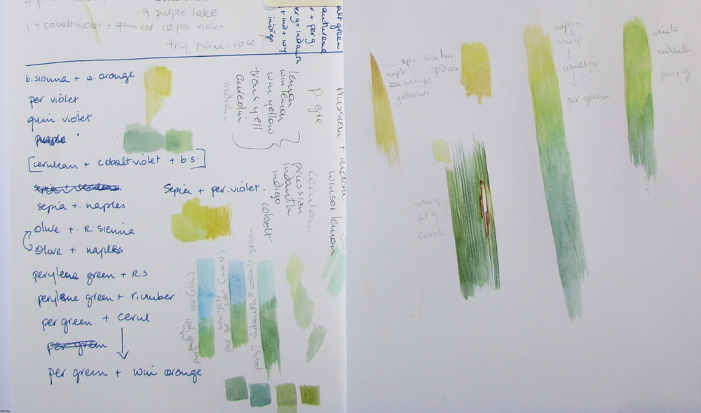
Yes, I do scribbly pages too!
The most useful thing about making a colour chart is that it is the best way to break an artist’s block. Every artist loses their inspiration from time to time, but a colour chart is a bit like doing musical scales on a piano. They don’t take a lot of thought, but the chances are that once you have got those fingers warmed up and the paint flowing, you’ll begin to make exciting discoveries. That urge to create will return.  Go on, pull those paints out!

As Paul Klee said “Colour is the place where our brain and the universe meet.”


“Colour is the keyboard, the eyes are the harmonies, the soul is the piano with many strings. The artist is the hand that plays, touching one key or another, to cause vibrations in the soul.”
Wassily Kandinsky


Sunday, 11 January 2015

The Slow Approach


Plan like a turtle; paint like a rabbit.
Edgar A. Whitney

Sometimes starting a painting can be so daunting because there are so many aspects to think about. So I’ve become a bit of a plodder. Rather than dive in, I’ll take the slow approach and happily spend a few days just getting to know my subject first.

Flowers get pulled apart and painted petal by petal.  

Leaves are placed on the page and painted over and over again until I’ve found that perfect green mix. Just the simple pleasure of painting little squares of colour can make me feel like I’m accomplishing things.

It’s not just botanical work that is given this treatment. This week I have a dead snipe on my desk. 


A friend called me to say that she had found the poor dead creature and had kindly popped it into her freezer for me! Some of the snipes here in Ireland are winter visitors from Faroe Islands and Iceland. Never having seen a snipe in real life, I was both intrigued and excited. 
Curiosity overcame any squeamishness.

Friday, 7 November 2014

Dutch Iris in Gouache


“Art is the unceasing effort to compete with the beauty of flowers - and never succeeding“
Gian Carlo Menotti

After all the excitement of my trip to Frankfurt, I was really looking forward to getting back into my studio once more and painting!!  The Natural Law Exhibition is just around the corner and I wanted to do another flower in gouache. Besides it gave me the wonderful excuse to fill the studio with vases of colourful blooms!


In the end I chose Dutch Iris, Iris hollandica, a pretty flower which is quite easy to find in the shops. This proved a wise decision because I had to replace the flower several times during the course of the painting. I wanted to use the same technique as the Stargazer lily, painting in gouache on dark green mount board. I began by selecting a bloom that had just opened, which I then positioned in front of dark green board. 

Friday, 3 October 2014

Alexander & Conkers


“Just to paint is great fun. The colours are lovely to look at and delicious to squeeze out. Matching them, however crudely, with what you see is fascinating and absolutely absorbing.”
Winston Churchill

I was completely taken by surprise when a beautifully wrapped parcel arrived last week from the States. 
Amongst the trove of treasures that lay within, was a curious little box with the words Alexander carefully written on the lid. Any other person might have first looked at the accompanying card, but caught up in the excitement of these unexpected gifts, I ripped open the little box …  and shrieked like a banshee when an enormous and very dead beetle fell out! 
A kind hearted friend, knowing my fondness for beetles, had found him and decided to post him to me. She called him Alexander after this lovely poem by A.A. Milne

Alexander is a ten lined June beetle, or watermelon beetle, a native of the USA. When I read up about these beetles, I discovered that the males have enormous antennae which they use to sniff out the females. Sadly, by the time that Alexander had made his transAtlantic crossing, he was missing both his antennae and the bulk of his legs, but with a bit of creative licence, I managed to restore him to his former glory and painted him at twice his actual size. His portrait will be winging it's way back to my thoughtful friend this week  (thank you DM). As another friend remarked “He’s the dandy of the Beetle World”.


I found a little beetle, so that Beetle was his name,
And I called him Alexander and he answered just the same.
I put him in a match-box, and I kept him all the day ...
And Nanny let my beetle out -
Yes, Nanny let my beetle out -
She went and let my beetle out -
And Beetle ran away. 
 

 Conkers


Feeling very pleased with myself, I decided to paint a few conkers. For those who don't know, conkers are the common name for the fruit of the Horse Chestnut tree, Aesculus hippocastanum 

Colour chart of earth pigments- there are quite a few that I don't use, but it's handy to see them all side by side like this.
I have a little colour chart of all the earth colours that I have which I always keep nearby. Although I do like to mix my own browns, it’s really useful to have a small chart like this and I constantly refer to it. It’s also quite startling to see the difference between the different brands of the same pigment, most notably Winsor & Newton’s raw umber and Daniel Smith’s raw umber. I use them both a lot!

Conker progression
The shiny new conkers are a joy to paint. Once I had figured out what colours to use and in what order, they are not too different from painting dates. They take careful observation, lots of layers and dry brushwork. 

As always I started with a base washes of cerulean and cobalt violet, taking care to reserve the highlights. Then I began with the lighter colours, getting progressively darker as more and more layers went on. I blended each layer as I went, and took care to keep the edges paler than the center. 

Cerulean, Cobalt violet, Cobalt (Daniel Smiths),Natural sienna, Winsor orange, Light red, Quinacridone gold deep (Daniel Smiths), Burnt sienna, Burnt Umber, Perylene maroon, Perylene Violet, Purple Lake, Raw Umber and Indigo. I also used Brown madder and Piemontite  (Daniel Smiths) on some of the darker conkers


Another little conker starts off. I've placed the conker on a separate sheet to protect the page, secured with a wad of Blu-Tack to stop it rolling off! You can see the initial washes here.
A few layers of paint later and you have a lovely polished conker

The cases were fun to paint too. I used a wash of Lemon yellow with a touch of sap green (the smallest amount), and then dropped in cerulean and a tiny bit of perylene green where needed. The spikes are the same earthy pigments of the conkers. I definitely needed a magnifying glass to paint those!

The finished page! This will used for my next Nature Sketchbook Exchange entry. 
Using all those transparent pigments has made me yearn for the silky softness of vellum, so conkers on vellum is next on my painting list! Mind you, the rosehips look very tempting too! With so much to choose from, I'm definitely going to be busy!


"Play keeps us vital and alive. It gives us an enthusiasm for life that is irreplaceable. 
Without it, life just doesn't taste good."
 Lucia Capacchione

Friday, 29 August 2014

From Ripe to Riper


“August rain: the best of the summer gone, and the new fall not yet born. The odd uneven time.”
 ~Sylvia Plath


It’s been yet another messy week of interruptions, but finally the kids are back in school, and hopefully, life will once more settle back into a blissful routine.  I miss my long painting days!

I have managed to keep the painting cravings at bay by doing some small studies of dates. Yes, a few fresh dates made their way back to Ireland with me, to be painted, eaten and hopefully planted. Fortunately they last a long time, especially when kept in an airtight container in the fridge.

The changing colour of dates from ripe to riper 
I love this stage of ripeness, known as “Rutab” in Arabic. The dates are very soft, sweet and moist, quite different to the dried stage which we are all familiar with. Ideally the dates would be left on the tree to become dry, but I might try to air-dry these myself. 


Meanwhile, I am just enjoying the wonderful rich reds of the ripe dates. I could never get bored of painting them, or eating them!


Someone asked me how I paint my highlights, so I have included a short step by step in this week’s post. Whilst you might not have fresh dates to paint, the same technique would be ideal for cherries, plums or rosehips, or any similar round shiny fruit.

Know your colours

Over the years I have accumulated quite a large collection of red paints. In fact, I have far too many paints of all colours (but at least they are cheaper than shoes) ! It’s really not necessary to have a huge number of paints, but it is important to know the cool tones from the warm, and also which colours are transparent, semi-transparent or opaque. The easiest way to do this is by making a colour chart. Lay them all out and decide which are closer to orange and which are closer to purple. Look to see which paints granulate, and which give clear smooth washes. Keep your colour chart close at hand. I often refer back to my colour chart whilst painting to help me decide which colour to use next.

Red colour charts. I've left some room on the larger one, just in case I happen to come across another red.

Check your lighting

The first thing that I always do is make sure that the lighting is good.  I prefer the traditional way of lighting from the left (I’m right-handed). I don’t like artificial lights, particularly overhead lights, as these can create confusing highlights and shadows. On very overcast days, I will use a daylight lamp and something shiny to bounce the light back up onto the subject, but in truth, nothing beats a natural light. You can see an example of a dark rainy day set up here

The date is placed on a small piece of paper to protect the paper beneath and then carefully drawn it out with a 2H pencil

Painting

Find your highlights. It’s important to take note of where they lie and also how shiny they are. I start with Cobalt violet and then add cerulean (Schmincke) to the shadows, making sure to leave the highlights clear. Usually the side which is furthest away from the light has more of a blue tone. I paint quite wet at this stage and let the colours blend on the paper. Sometimes highlights are very bright, but here they were soft, so I kept the edges of the highlights soft by using a second damp brush to blend it all in.

These are the colours that I used for this date, starting with the ones on the left

When I first started painting botanicals, I remember feeling quite confused by the term “disappearing edges”, which is often used to describe how the surface of a fruit curves away from you. I kept wondering how an edge can disappear, if I can so obviously see it! A better way to describe this process is to say “bring the middle bit forward”, although admittedly that’s a bit of a mouthful! To create this effect, you use warmer colours in the centre of the fruit, and build up the layers of transparent colours so that the middle part is the most saturated, leaving the paint around the edges is quite thin.


I usually start in the center with a bit of winsor orange which is a nice yellow orange, and then winsor orange-red,  building up the layers of colour and using progressively darker reds, until I am on to the purples. I paint quite drily, but always make sure that my brushstrokes follow the form of the fruit (across the width and along the length, never diagonally), and as the fruit has a smooth surface, I try to blend it all in with a second damp brush as I go along.

There is always a stage where you look at it and think it looks dreadful, but persevere!


Save little details like the stalk or tiny blemishes until the end. Often it’s the little details that can bring it to life.
Have fun!

Six dancing dates  ©Shevaun Doherty 2014

"If you chase perfection, you often catch excellence" 
William Fowble


Saturday, 19 July 2014

A Date with Colour

To be a botanical artist, you need a certain amount of obsessiveness.
Some botanical artists are obsessed with colour, making endless colour charts and memorising pigment numbers and characteristics. Others are passionate about certain plants or  habitats, tenderly creating their own leafy paradises, or travelling to the far corners of the earth to find their subject.

Date studies, 2012
For me, it’s dates (Phoenix dactlifera). I really love painting them. You would think that having painted them so many times over the years that I would be bored of them by now, but I’m not. I still find them fascinating and I still learn something new every time I paint.

Date studies 2013
Now at last the dates have started to ripen. They hang heavy in the trees, full size now, slowly changing from green to a beautiful soft pink, and every colour in between. Gradually they will turn a rich red colour, crunchy and sweet, darkening slowly through the whole range of reds and purples until they are a delicious black, becoming as soft and juicy as a plum. After that they slowly dry out and become the brown fruit that is so familiar to us all. I will need every colour in my box to capture these changes.

Date Studies 2013
They are still not ready for eating, but I want to capture the changes. Last year I did some colour studies of this green to red stage, but of a different variety. For the RHS I have chosen to work on a variety that is more common in Egypt called Hayani. It tastes better too, always a bonus.


Armed with my colour notes from both last year and my leaf studies, I started with the green dates. It’s fair to say that I struggled. The green dates had a blush of pink, and a layer of bloom which made it a challenge, because when you mix green and red you get mud.

So I just kept practicing and practicing, filling my page with dates.  Date Studies 21014
I discovered that the bloom colour depends on the underlying pigment. Where there is a green part, I used cobalt teal and cobalt. Where there was a red part, I would use permanent rose and cobalt violet. First I wet the whole of the date with clean water, and whilst it was still damp, dropped in these bloom colours, allowing the pigments to mix.  Avoiding the areas where the highlights were, I would blend in some Naples in the centre part whilst it was all still damp. I would then build up the layers of paint, blending all the time with a soft clean brush, being careful to retain both the highlights and the softer colours along the edges.

I ended up using a lot of colours! 
I've a nice big palette, but I only used about half of the paints here.
The most important thing though is to closely observe what you are painting… there are shadows and reflections where you don’t expect it. Sometimes the whole thing can come to life with the addition of a blemish or mark. From time to time, I would take some of the layers back off using clean water and kitchen towel.


 I decided to do another quick study, this time with the dates hanging in front of me. 

At first I was going to draw one little spikelet and perhaps not paint every date, but it’s addictive! I couldn't stop!!

 I will use these colour studies for a larger painting that I plan to do when I return to Dublin. 
As they say, practice makes perfect!

Color study of ripening dates, Phoenix dactylifera  'Hayani'  ©Shevaun Doherty 2014

"The creative habit is like a drug. The particular obsession changes, but the excitement, the thrill of your creation lasts.
Henry Moore