“Take rest; a field that has rested gives a beautiful crop” Ovid
After my flurry of painting last week, I needed to a few
days to unwind, and there’s really no better place to relax and contemplate
life, than under the gently swaying fronds of a palm tree.
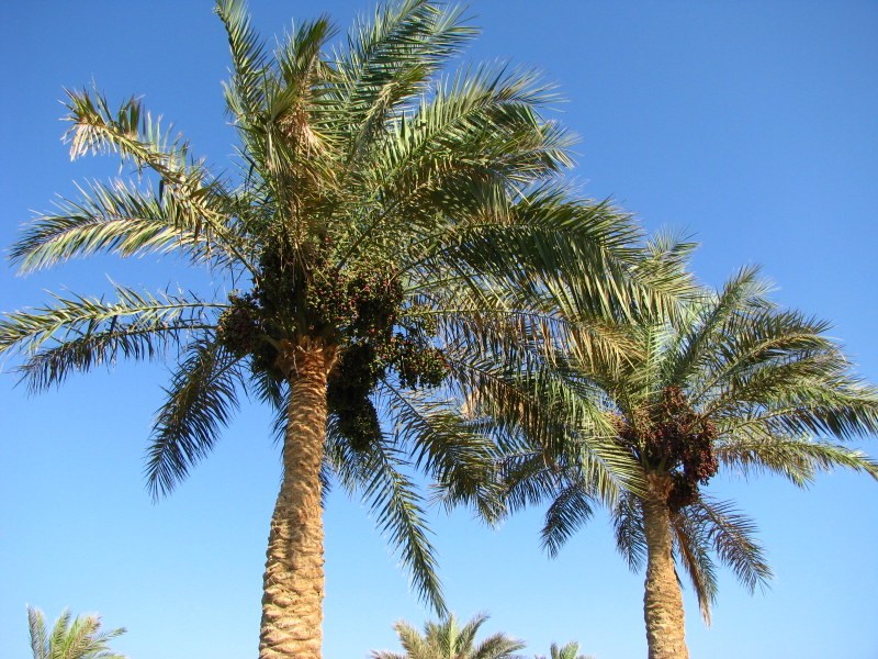
I love date palms. They are such beautiful trees,
particularly when laden with fruit, and I have been inspired to paint them many
times over the years. The date palm,
Phoenix dactylifera was an obvious choice when it came to selecting a theme for my
RHS paintings. Unfortunately they don’t grow
well in Ireland, so whilst I am here in Egypt, I need to gather as much visual information
as possible (colour studies, sketches and photographs), to enable me to
complete the paintings when I return to Dublin.
 |
| Dates and palm leaves studies from last year |
For the last couple of years, I have concentrated on painting the fruit,
but for the RHS I want to show all the aspects of this tree that make it so
unique. So I have been reading everything that I can about this plant and trying to
decide just how to depict it.
However before I can begin, I need to sort out my colour
palette! Whilst I was happy enough painting the dates last year, the leaves
were a struggle. Try as I might, I just could not get the right green. Green is
always a difficult colour to get right, and palm leaves are a particularly
elusive blue-green shade.
One of the reasons for their unusual colour is the waxy bloom
that covers both the fruit and the leaves.
All plants have this bloom- you can
see it quite clearly on fruit such as plums and grapes, but it’s very apparent
on desert plants. For years people thought that this bloom was caused by wild
yeast cells, but recent discoveries have shown that this
bloom, or epicuticular wax, is an important part of the plant. It's main role is to prevent water loss. It also reflects UV radiation and helps deter insects by making
it difficult for them to walk on or lay eggs. Amazingly if the wax is
accidently rubbed off the plant, it will grow back. Finally it helps the plant
to self-clean, causing water to bead up and roll off, taking particles of dirt and
dust with it. I found this
really informative article which is well worth reading.
Bloom is also notoriously difficult to depict in
watercolours, particularly when the use of white is so frowned upon. I know
that some artists paint bloom by mixing a tiny bit of cobalt with white gouache and drybrush
it on afterwards, but most (myself included) carefully paint the bloom first
and build up the darker colours around it. The problem is trying to find the
right bloom colour!
 |
| There was just one thing to do… make a colour chart of soft greens. The right one must be in there somewhere!! |
Last year I read a really great
article on the ASBA website by Carolyn Payzant, a botanical artist who has spent a lot of time painting the
desert plants of Arizona. To achieve those grey blue greens, she recommended
Oxide of Chromium. To my delight, I found that she was right. However Oxide of
Chromium is not an easy colour to use. It’s very opaque and also heavily
staining, a description that will have most botanical artists backing away in
horror! I think the trick to using a colour like this is first to use it
sparingly, and also to only mix it with transparent or semi-transparent pigments.
 |
| Sometimes the only way to get a colour right, is to keep practicing over and over again |
I played around with several mixes and found that W&N Winsor
yellow and M. Grahams Cobalt blue gave the best results. The big success of the
day was M. Grahams Cobalt teal. What a gorgeous colour for bloom! I found that
using Cobalt teal in my first washes gave that perfect glaucous blue, especially when
I allowed a wash of Cobalt to bleed into that first wash.
 |
| Experiment with different mixes and don't forget to write down the names of the pigments |
Alas, I have fallen out of love with my
Saunders Waterford sketchbook. I really liked the look and size of this sketchbook, and have been
using this for my date studies. The deckled edges and the creamy colour are so
appealing, but I just don’t like the paper. It’s far too absorbent and rough. I
switched to a piece of Fabriano Artistico to paint some date seedlings and was
immediately amazed at how much nicer the surface was to paint on. It was much
easier to get clean crisp edges on the Fabriano. I’ll still continue to use the
sketchbook, but will probably stick sheets in.
 |
| A trio of date seedlings- colour studies which I plan to use in one of my future RHS paintings |
I couldn’t resist painting one little date using the same green
mixes as the leaves. This date is unripe and not full size, but the ones on the
trees are beginning to turn a rosy pink. No prizes for guessing what I’ll be
painting next week!
"Colour is my day-long obsession, joy and torment."
Claude Monet