Showing posts with label step by step. Show all posts

Monday, 21 September 2015

Beware of the Agapanthus


Agapanthus flowerhead (work in progress) Shevaun Doherty
Agapanthus II (unfinished) Shevaun Doherty 2015 
"Procrastination is like a credit card: it's a lot of fun until you get the bill."
Christopher Parker

I love what I do, but sometimes it’s a struggle. On my easel is

Sunday, 6 September 2015

In the footsteps of Ellen Hutchins


Shevaun Doherty SBA Botanical Artist
"An understanding of the natural world and what's in it,
is a source of not only a great curiosity but great fulfillment." 
David Attenborough

A curious mind is an essential part of being a botanical artist, so when I was asked by Howard Fox,  botanist at the National Botanic Gardens, to get involved with the Ellen Hutchins bicentenary celebrations, I said

Friday, 21 August 2015

The Big Blue Monster

 
Agapanthus africanus WIP, Shevaun Doherty, botanical art
Agapanthus africanus WIP © Shevaun Doherty 2015

“Perseverance, secret of all triumphs.”
Victor Hugo

I am not a flower painter. 
Don’t get me wrong, I adore flowers of every kind, and I really admire artists who can capture that transient beauty with what seems like effortless grace. I’m just far happier painting fruit, seeds and dried plants, where I can indulge myself in the luxury of time, knowing that they aren’t going to wilt before my eyes.

Agapanthus africanus studies, Shevaun Doherty
Initial studies
The Agapanthus africanus is really not for the faint hearted. It’s a big robust ball of blueness that stands out taller than it’s neater cousins, Agapanthus praecox. Whilst doing my bud studies, I noticed with a bit of alarm, that there were over 50 flowers in each umbel! (I counted them in a fit of procrastination) Okay, so they weren’t all going to open at the same time, but once they started to open, it was definitely going to be a race against time.


So how to start?

Friday, 7 August 2015

Buds and Blooms

Agapanthus bud, Shevaun Doherty, botanical art
Agapanthus bud © Shevaun Doherty 2015
"Each flower is a soul opening out to nature." 
-  Gerald De Nerval

They say that there is no greater motivating factor than a deadline, but for a botanical artist, the realisation that the flowers are just not going to wait for their portrait to be painted is enough to get even the slowest of brushes flying!

After months of waiting patiently for the flowers to appear, my beautiful blue Agapanthus africanus flowers are now all blooming at once. Mild panic sets in as I suddenly realise

Saturday, 1 August 2015

Summertime Blues

Shevaun Doherty Agapanthus bud botanical painting

“Blue colour is everlastingly appointed by the deity to be a source of delight.”
John Ruskin

Blue is the colour that sings to us of heaven and sky, of fresh water and deep oceans, of spirituality, serenity and stability. It’s definitely one of my favourite colours, and yet I don’t seem to paint many blue subjects. All that is about to change, because I have a garden full of blues … tall elegant Agapanthus flowers that are just coming into bloom.


The first challenge with any new plant is the set-up. It’s great when

Monday, 23 February 2015

Hey Mambo!


Oriental Hybrid Lily Lilium 'Mambo'  © Shevaun Doherty 2015

‘We draw the spring into our hearts and feel that life is good’ 
Oscar Wilde

My studio this week has filled with sunshine, music and flowers.  I’m not dancing but painting the Mambo, a beautiful purple Oriental lily with a seductive sweet scent. This flower is such a sassy diva that I knew that I had to paint it as soon as I laid eyes on it.

Ah, there really is nothing quite as pleasant painting with the intoxicating scent of flowers in sunshine. 

The biggest challenge of course was going to be capturing that striking colour. I have quite a good range of pinks, reds and purples but this was a good opportunity to play with some of the Daniel Smith dot charts. For those who don’t know what a dot chart is, it’s a tester chart with a splodges of watercolour. Daniel Smith paints have quite intense colours and a little seems to go a very long way. 


As always, I was surprised at how different the same paint name differs from brand to brand. Daniel Smith Perylene violet is now definitely on my wishlist, although the W&N Perylene violet is still a favourite. Quinacridone fuschia, Rhodonite and Permanent violet are now all on my wishlist. I just can't get enough colour.


I pulled apart a flower and painted a single petal. It was not easy to get that rich colour! I was going to have to paint so many layers of paint! I was also struggling to get back into painting on paper and using bigger brushes with wetter washes. I did a quick study of an opening flower to get my head back into that style of painting. 

It’s a good idea when drawing out a flower to take the outer measurements. I often find that my drawings grow on the page and that's so annoying. An easy way to stop this from happening is to draw a simple box and make the flower fit. This isn’t a botanical illustration so I wasn’t too worried about getting precise measurements. (Apologies to the purists out there!)

Monday, 9 February 2015

Conkered

Per aspera ad astra-
Through difficulties to the stars

There has been a battle in my studio this week. Whilst my paperwork mountain was slowly being tackled, a little conker  sat on my desk, patiently awaiting my attention.
 I love painting conkers(Aesculus hippocastanum). I don’t know whether it’s the rich earthy colours or that tactile smoothness, but they make the perfect subject.

My page of conkers has now been stuck into Dianne's sketchbook for the Nature Trails Sketchbook Exchange
 I have painted them quite a few times now, but always on paper, never on vellum. I did try once, but gave up in exasperation. To get that rich patina you need quite a few layers of paint, and that can be a challenge on vellum. Suddenly you can find that you’re lifting paint off instead of adding another layer, and the more that you try to fix it, the quicker it turns into a blobby, patchy mess.
However, undeterred by the last disaster, I began.


I was feeling confident. I threw on a few initial washes of colour.

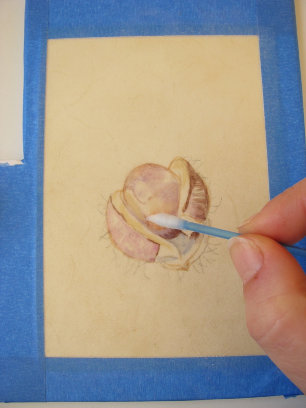
It wasn’t long before I was trying to fix things using a dampened cotton bud. Because the paint sits on the surface of the vellum, it's easy to wipe off. Perhaps a little too easy.

 However as I progressed, it became apparent that I had not put in enough blue in my initial washes, essential for that convincing gleam. I began to fuss, and it quickly became a horrible mess. I tried to scrape some of it off, but this is natural calf vellum, not kelmscott, which has a chalky coating, and so I ended up scuffing up the surface. The paint got caught in it and stained, leaving a dark and horrible patch. I wiped as much as I could off.

Attempt #2- I have to disguise that horrible dark patch
I decided to start again, but moved the conker up on the vellum to cover the recriminating patch. This time, I decided to start on the polished conker, ignoring the prickly cases.


Sometimes starting again can be the best option. You are aware of the mistakes that you have made and so take care to avoid them.


The colours that I used this time were similar to the ones that I used before, but with a few changes. I used Indanthrene instead of Cobalt and avoided Indigo altogether. For my really dark darks, I used Perylene violet with a little Perylene green. I also used a tiny bit of Transparent Brown Oxide and Burnt Bronzite from my Daniel Smith dot charts for the shell.


I ran out of daylight hours in my haste to finish this, so the photograph of the finished piece is not the best. I’m quite pleased with how it turned out though and glad that I persisted.


Today I was given some glorious lilies, exuberant beauties that are just begging to have their portrait painted. My palette will be washed, the earth colours put away and those delicious purple pigments will be coming out to play! Even the paperwork pile is looking less daunting.

That which we persist in doing becomes easier - not that the nature of the task has changed, but our ability to do has increased.” 
Ralph Waldo Emerson

Monday, 29 December 2014

The Painted Lady


“Just living is not enough," said the butterfly, "one must have sunshine, freedom, and a little flower.”
Hans Christian Andersen

Just before Christmas, a parcel arrived at my home. It was a gift from a friend and contained the most wonderful selection of natural treasures, the jewel of which had to be a tiny pinned


I have a very special place in my heart for these tiny creatures because they take part in one of Nature’s most impressive journeys every year. They fly over 2000 km from the UK and Ireland to North Africa. It puzzled scientists for years as to how they did it, until they recently discovered that these butterflies ascend to a height of 500 metres and windsurf all the way down to North Africa, reaching speeds of over 45km an hour!! It’s not just a one way migration either, because many of the butterflies make the return journey too. 
You can read about the incredible journey here


I have painted the butterfly before, a small specimen that I found in Egypt, slightly battered and with it’s wings folded. The underwings are quite drab in comparison.  Painting from a photograph is never as exciting. I marvelled at the iridescence on the wings and the long soft hairs that cover the butterfly’s thorax and abdomen. It’s very hairy in fact! I couldn’t wait to paint it!

Drawing the butterfly and tracing out the design

I decided to paint it on a small piece of natural calf vellum. This differs from the kelmscott vellum because it is unbleached and shows all the natural pigmentation and blemishes. It’s still lovely to paint on. Graphite can mark vellum, so I drew out the butterfly on paper first, taking care to get the markings and measurements right. Once that was done, I traced it and transferred the drawing to the vellum.


Tip- butterflies are symmetrical so it’s a good idea to check that the symmetry is balanced using the tracing paper. Simply flip it over the tracing and place it over the drawing. It doesn’t have to be perfect, but will indicate whether everything is in the right place. It’s better to get it right at this stage.

As is my habit, I pulled out a colour chart to give me guidance whilst I paint. I don’t use all of these colours, just a few, and these are all pure, not mixes. With vellum it's better to use the transparent colours.

I also kept the tracing to the side as guidance, because the drawing was so faint on the vellum.
Sparkly paints? Oh yes please!

I  decided to use the Daniel Smith iridescent paints. The colour chart showed me that Saguaro Green would be perfect. Just a tiny bit would be enough, and used only at the end so as not to mess up the other paints. 

I began to redraw the butterfly markings using a very fine sable brush and some burnt umber. I decided not to do a thin wash over the whole wing first because I didn’t want to lose those markings. They are vital to the identification on the butterfly.


Once the markings are defined, it’s a matter of slowly building up the depth of colour and adding the orange colour of the wings using a dry brush. With vellum the paint sits on the surface, giving it a wonderful luminosity, but if you try putting on a wet wash over the paint, it will lift the lower layers off.  I constantly looked for the abstract patterns within the wings to compare both sides. 
I also added an antennae to the poor little butterfly… in real life it was missing one and would have looked odd without a bit of artistic licence.


I regularly switch between painting from sight, to using a magnifier. I find that I need both to get it right. I just use a cheap magnifier (from Argos) with a long arm which can be easily pulled over the painting or pushed away.


Glitter!
Finally, like the icing on the cake, I added the iridescent paint. I felt like a kid with some glitter glue… what decadent fun! I had to force myself to put the paintbrush down before I got carried away.
So there you go, one sweet little butterfly! 
It’s so nice to be back in the studio painting after all the festivities and I have yet more lovely treasures waiting to be painted! 

I wish you all a very Happy New Year!

 “The beauty of the natural world lies in the details.”
Natalie Angier


Wednesday, 10 December 2014

How to deal with Prickles

The greater the obstacle, the more glory in overcoming it.”  
Molière


Finding time to paint and blog at this time of year isn’t easy! So when I came across a box of peculiar prickly things in Dublin's Fruit and Vegetable Market, I  knew that these odd looking things would be the perfect subject. They wouldn’t wilt or fade overnight, and they were just so bizarre that they had to be painted.Thanks to some clever botanical detective work by some friends (thank you guys), I found out that they were types of wild cucumber. 

And so the fun begins.
Depicting the prickles was my biggest problem with these little cucurbits. There are a number of ways to do this. I could paint carefully around each one, but that would be pushing my patience and skills to the very limit! I could also paint the skin without the prickles and then try to lift the paint back off.  I could paint the skin and then add the prickles using opaque gouache. Or I could take the easy option and mask off the prickles first.


Sunday, 23 November 2014

Feathers

A busy desk is a happy desk.
This week has been a challenging one, but when times get tough, the best place to escape is into the quiet sanctuary of my little studio.  I was looking for something suitable to paint when, whilst flicking through an old sketchbook from Egypt, a bag of feathers fell out. They were hoopoe feathers.

A very old sketch done after a trip the the Egyptian Museum
I remember how astonished I was the first time that I saw a Hoopoe bird, Upupa epops, with it’s dramatic crown of golden feathers tipped with black, and striking black and white plumage. They are quite unlike any other bird, and it’s easy to understand why people have always been fascinated with them. 


The Ancient Egyptians revered them, the Greeks and Persians wrote stories about them. They are mentioned in the Bible and also in the Koran, where there is a delightful tale about the Hoopoe, King Solomon and the Queen of Sheba. 
They fly in such a strange way too, like giant swooping butterflies, and make a very distinctive call which gives them their arabic name of hudhud.

However my tale of the hoopoe is a little sad.

 There were a pair of hoopoes that lived near my Cairo home (apparently hoopoes mate for life). I used to love watching them foraging on the grass together. Disaster struck one day when a kestrel swept down and killed one of them. I tried to intervene, but I was too far away, and all that was left was a small pile of wing feathers which I duly gathered up.


So feathers became my distraction for the week. 


Having painted three little hoopoe feathers, I decided to paint another large feather that I had found in Egypt. I still have no idea what bird this came from, perhaps a grouse?  Feathers can be quite tricky to paint. Although they don’t wilt or move like plants do, they require a fair bit of patience and a lot of fine brushwork. Once I have mapped out the patterns of the feathers, I then go over with a fine brush building up the layers of colour.


My mystery feather. The other little one came from a cushion
I have built up quite a collection of earth colours and although I do like to mix up my browns, sometimes it’s just easier to use them straight from the tube or pan. I find that the Daniel Smith paints have a particularly nice range of colours- I love their raw umber and buff titanium, both quite unlike any other colour and so useful. Winsor and Newton manganese brown, burnt sienna and sepia were also very useful with the feather palette.
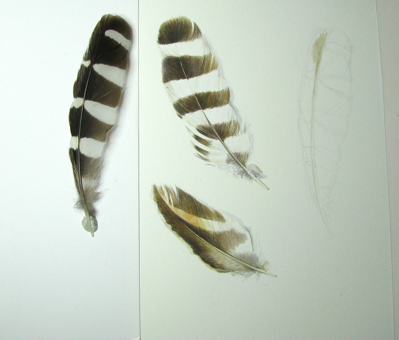
Earth colour chart
A lovely curly goose feather from Frankfurt then took centre stage, lending a bit of movement to the composition. I don’t have a huge range of feathers, but I found a hairband in Tesco which I carefully pulled apart to give me a couple more. I’ve no idea what bird these came from, but they are very pretty.


An unidentified Tesco hairband feather!

I really enjoyed painting these feathers. They are definitely a subject that I will be painting again, although I really need some new ones for my collection. In the meantime, this page of feathers will go into my friend Terri Dauncey's sketchbook, for the Nature Sketchbook Exchange.


“It's not enough to have the feathers. 
You must dare to fly!” 

― Cass van Krah