Showing posts with label Phoenix dactylifera. Show all posts

Friday, 29 August 2014

From Ripe to Riper


“August rain: the best of the summer gone, and the new fall not yet born. The odd uneven time.”
 ~Sylvia Plath


It’s been yet another messy week of interruptions, but finally the kids are back in school, and hopefully, life will once more settle back into a blissful routine.  I miss my long painting days!

I have managed to keep the painting cravings at bay by doing some small studies of dates. Yes, a few fresh dates made their way back to Ireland with me, to be painted, eaten and hopefully planted. Fortunately they last a long time, especially when kept in an airtight container in the fridge.

The changing colour of dates from ripe to riper 
I love this stage of ripeness, known as “Rutab” in Arabic. The dates are very soft, sweet and moist, quite different to the dried stage which we are all familiar with. Ideally the dates would be left on the tree to become dry, but I might try to air-dry these myself. 


Meanwhile, I am just enjoying the wonderful rich reds of the ripe dates. I could never get bored of painting them, or eating them!


Someone asked me how I paint my highlights, so I have included a short step by step in this week’s post. Whilst you might not have fresh dates to paint, the same technique would be ideal for cherries, plums or rosehips, or any similar round shiny fruit.

Know your colours

Over the years I have accumulated quite a large collection of red paints. In fact, I have far too many paints of all colours (but at least they are cheaper than shoes) ! It’s really not necessary to have a huge number of paints, but it is important to know the cool tones from the warm, and also which colours are transparent, semi-transparent or opaque. The easiest way to do this is by making a colour chart. Lay them all out and decide which are closer to orange and which are closer to purple. Look to see which paints granulate, and which give clear smooth washes. Keep your colour chart close at hand. I often refer back to my colour chart whilst painting to help me decide which colour to use next.

Red colour charts. I've left some room on the larger one, just in case I happen to come across another red.

Check your lighting

The first thing that I always do is make sure that the lighting is good.  I prefer the traditional way of lighting from the left (I’m right-handed). I don’t like artificial lights, particularly overhead lights, as these can create confusing highlights and shadows. On very overcast days, I will use a daylight lamp and something shiny to bounce the light back up onto the subject, but in truth, nothing beats a natural light. You can see an example of a dark rainy day set up here

The date is placed on a small piece of paper to protect the paper beneath and then carefully drawn it out with a 2H pencil

Painting

Find your highlights. It’s important to take note of where they lie and also how shiny they are. I start with Cobalt violet and then add cerulean (Schmincke) to the shadows, making sure to leave the highlights clear. Usually the side which is furthest away from the light has more of a blue tone. I paint quite wet at this stage and let the colours blend on the paper. Sometimes highlights are very bright, but here they were soft, so I kept the edges of the highlights soft by using a second damp brush to blend it all in.

These are the colours that I used for this date, starting with the ones on the left

When I first started painting botanicals, I remember feeling quite confused by the term “disappearing edges”, which is often used to describe how the surface of a fruit curves away from you. I kept wondering how an edge can disappear, if I can so obviously see it! A better way to describe this process is to say “bring the middle bit forward”, although admittedly that’s a bit of a mouthful! To create this effect, you use warmer colours in the centre of the fruit, and build up the layers of transparent colours so that the middle part is the most saturated, leaving the paint around the edges is quite thin.


I usually start in the center with a bit of winsor orange which is a nice yellow orange, and then winsor orange-red,  building up the layers of colour and using progressively darker reds, until I am on to the purples. I paint quite drily, but always make sure that my brushstrokes follow the form of the fruit (across the width and along the length, never diagonally), and as the fruit has a smooth surface, I try to blend it all in with a second damp brush as I go along.

There is always a stage where you look at it and think it looks dreadful, but persevere!


Save little details like the stalk or tiny blemishes until the end. Often it’s the little details that can bring it to life.
Have fun!

Six dancing dates  ©Shevaun Doherty 2014

"If you chase perfection, you often catch excellence" 
William Fowble


Sunday, 27 July 2014

From Seed to Tree


“Every seed is a longing”   Khalil Gibran

Hayani dates

When excavating the Temple of Herod the Great in 1965, a dusty jar of date seeds was discovered. At the time of Herod, the kingdom of Judea was renowned for it’s forest of date trees, which had a distinctive sweet taste. Such was their importance to the economy, the palm tree was depicted on the coins of that time. However by 500AD, all the date trees had been cut down and the Judean palm tree was no more. This cache of ancient seeds was stored for a further 40 years, until  2005, when an inquisitive botanical researcher decided to try to grow one.  Three seeds were treated with a special solution of fertiliser and hormones. To everyone’s amazement, one little seed began to sprout, 2000 years after it fell off the tree, making it the oldest viable seed in the world. This tree, still grows today and is the last of the famous Judean date trees. Palm trees are dioecious (meaning it has separate male and female plants), and this tree is a male. So to continue the line, it is hoped to crossbreed it with it’s nearest living relative, the Hayani date palm from Egypt.

It’s been really interesting to do all this research about date palms. Beside the fact that the dates themselves are such wonderful subjects to paint, there is also a wealth of fascinating history to accompany the date palm.  My main objective this summer though has been to identify the main characteristics of the palm tree, and to figure out just how to portray all those features in six paintings for the RHS.
 One of my paintings will be the story of the seed.

Phoenix dactylifera seedling studies

Walking through the gardens here, I was struck by how many tiny seedlings were growing beneath each tree. I dug a few up and took them home to paint. The first few that I painted are still quite small, 6-10 months old. 

Study of older seedling showing the juvenile leaves which are non pinnate and entire
I also found a larger seedling, probably about 18-24 months old but still showing the juvenile leaves which are quite different to the adult ones. As this is quite large, I decided that I would carefully draw this out on tracing paper for now, backing it up with a few colour studies and numerous photographs.

A larger study on tracing paper which will be used later
But there was still one element missing from this story, and that was the seed itself. A friend mentioned to me that she once had a date seed that had accidentally sprouted in her compost in Ireland. Inspired by her story, I decided to see if I could grow my own. If a 2000 year old seed can grow, then surely I could coax at least one to sprout?
I soaked the seeds for two days in water, and then carefully placed them smooth side down on wet kitchen paper in a ziplock bag. I left the bag open but covered it lightly with a cloth. Fingers crossed!
Little date seeds grow into beautiful trees, so I also need to paint a tree.
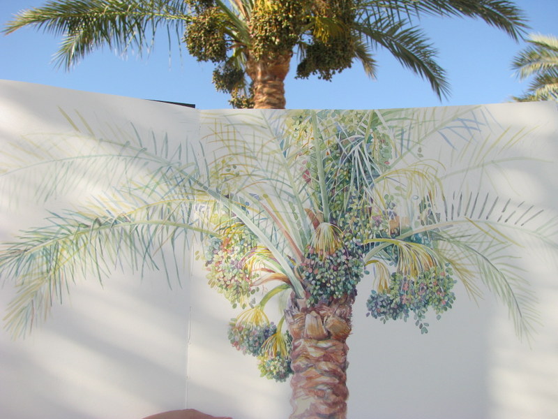
Palm tree with fruit, plein air study 2103
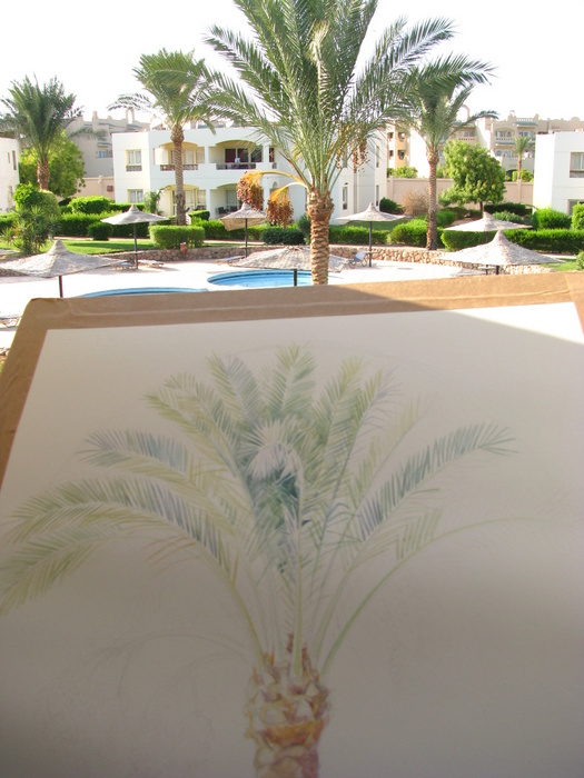
Last year I spent a couple of enjoyable afternoons by the pool painting a palm tree, which was laden with fruit. It was great in that it gave me a good idea of what colours to use, but it was hard to fit it all onto the page and I felt that the bountiful fruit set the composition off balance. I wanted to do a study of the whole tree. I’ve been putting it off because this summer has been really hot, making painting outside quite a challenge. Fortunately there is a beautiful tree just outside my window, so I took the easier air conditioned option. 

It's hot out there!
I haven’t managed to finish it yet because it’s quite a big study (70cm high), and painting all those leaves takes a lot of concentration!  But there's something quite soothingly hypnotic in building up the patterns within the crown of the tree and  painting all those negative spaces. 


Palm tree study WIP 


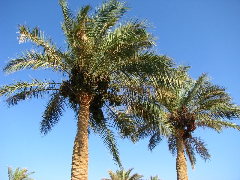
Whilst I have been doing all these preparatory studies, the dates have been ripening slowly on the trees. To my delight, one of the gardeners offered to climb up and pick some of the riper ones which hang just out of my reach. My fridge is now full of sweet crunchy dates, some to eat and of course, plenty to paint.

Gathering dates for me!

However the best news of the week has to be this! After two weeks of careful incubation, I have my first sprout! I have so much to paint before I leave.


“The plant reveals what is in the seed.” Ancient Egyptian proverb

Saturday, 19 July 2014

A Date with Colour

To be a botanical artist, you need a certain amount of obsessiveness.
Some botanical artists are obsessed with colour, making endless colour charts and memorising pigment numbers and characteristics. Others are passionate about certain plants or  habitats, tenderly creating their own leafy paradises, or travelling to the far corners of the earth to find their subject.

Date studies, 2012
For me, it’s dates (Phoenix dactlifera). I really love painting them. You would think that having painted them so many times over the years that I would be bored of them by now, but I’m not. I still find them fascinating and I still learn something new every time I paint.

Date studies 2013
Now at last the dates have started to ripen. They hang heavy in the trees, full size now, slowly changing from green to a beautiful soft pink, and every colour in between. Gradually they will turn a rich red colour, crunchy and sweet, darkening slowly through the whole range of reds and purples until they are a delicious black, becoming as soft and juicy as a plum. After that they slowly dry out and become the brown fruit that is so familiar to us all. I will need every colour in my box to capture these changes.

Date Studies 2013
They are still not ready for eating, but I want to capture the changes. Last year I did some colour studies of this green to red stage, but of a different variety. For the RHS I have chosen to work on a variety that is more common in Egypt called Hayani. It tastes better too, always a bonus.


Armed with my colour notes from both last year and my leaf studies, I started with the green dates. It’s fair to say that I struggled. The green dates had a blush of pink, and a layer of bloom which made it a challenge, because when you mix green and red you get mud.

So I just kept practicing and practicing, filling my page with dates.  Date Studies 21014
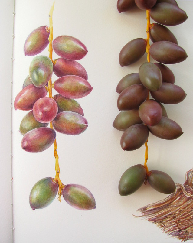
I discovered that the bloom colour depends on the underlying pigment. Where there is a green part, I used cobalt teal and cobalt. Where there was a red part, I would use permanent rose and cobalt violet. First I wet the whole of the date with clean water, and whilst it was still damp, dropped in these bloom colours, allowing the pigments to mix.  Avoiding the areas where the highlights were, I would blend in some Naples in the centre part whilst it was all still damp. I would then build up the layers of paint, blending all the time with a soft clean brush, being careful to retain both the highlights and the softer colours along the edges.

I ended up using a lot of colours! 
I've a nice big palette, but I only used about half of the paints here.
The most important thing though is to closely observe what you are painting… there are shadows and reflections where you don’t expect it. Sometimes the whole thing can come to life with the addition of a blemish or mark. From time to time, I would take some of the layers back off using clean water and kitchen towel.


 I decided to do another quick study, this time with the dates hanging in front of me. 

At first I was going to draw one little spikelet and perhaps not paint every date, but it’s addictive! I couldn't stop!!

 I will use these colour studies for a larger painting that I plan to do when I return to Dublin. 
As they say, practice makes perfect!

Color study of ripening dates, Phoenix dactylifera  'Hayani'  ©Shevaun Doherty 2014

"The creative habit is like a drug. The particular obsession changes, but the excitement, the thrill of your creation lasts.
Henry Moore

Saturday, 12 July 2014

Bloom and Leaves

Take rest; a field that has rested gives a beautiful crop”  Ovid

After my flurry of painting last week, I needed to a few days to unwind, and there’s really no better place to relax and contemplate life, than under the gently swaying fronds of a palm tree.


I love date palms. They are such beautiful trees, particularly when laden with fruit, and I have been inspired to paint them many times over the years. The date palm, Phoenix dactylifera was an obvious choice when it came to selecting a theme for my RHS paintings. Unfortunately they don’t grow well in Ireland, so whilst I am here in Egypt, I need to gather as much visual information as possible (colour studies, sketches and photographs), to enable me to complete the paintings when I return to Dublin.

Dates and palm leaves studies from last year
For the last couple of years, I have concentrated on painting the fruit, but for the RHS I want to show all the aspects of this tree that make it so unique. So I have been reading everything that I can about this plant and trying to decide just how to depict it.

However before I can begin, I need to sort out my colour palette! Whilst I was happy enough painting the dates last year, the leaves were a struggle. Try as I might, I just could not get the right green. Green is always a difficult colour to get right, and palm leaves are a particularly elusive blue-green shade.


One of the reasons for their unusual colour is the waxy bloom that covers both the fruit and the leaves. 

All plants have this bloom- you can see it quite clearly on fruit such as plums and grapes, but it’s very apparent on desert plants. For years people thought that this bloom was caused by wild yeast cells, but recent discoveries have shown that this bloom, or epicuticular wax, is an important part of the plant. It's main role is to prevent water loss. It also reflects UV radiation and helps deter insects by making it difficult for them to walk on or lay eggs. Amazingly if the wax is accidently rubbed off the plant, it will grow back. Finally it helps the plant to self-clean, causing water to bead up and roll off, taking particles of dirt and dust with it. I found this really informative article which is well worth reading.

Bloom is also notoriously difficult to depict in watercolours, particularly when the use of white is so frowned upon. I know that some artists paint bloom by mixing a tiny bit of cobalt with white gouache and drybrush it on afterwards, but most (myself included) carefully paint the bloom first and build up the darker colours around it. The problem is trying to find the right bloom colour!

There was just one thing to do… make a colour chart of soft greens. The right one must be in there somewhere!!

Last year I read a really great article on the ASBA website by Carolyn Payzant, a botanical artist who has spent a lot of time painting the desert plants of Arizona. To achieve those grey blue greens, she recommended Oxide of Chromium. To my delight, I found that she was right. However Oxide of Chromium is not an easy colour to use. It’s very opaque and also heavily staining, a description that will have most botanical artists backing away in horror! I think the trick to using a colour like this is first to use it sparingly, and also to only mix it with transparent or semi-transparent pigments.

Sometimes the only way to get a colour right, is to keep practicing over and over again
I played around with several mixes and found that W&N Winsor yellow and M. Grahams Cobalt blue gave the best results. The big success of the day was M. Grahams Cobalt teal. What a gorgeous colour for bloom! I found that using Cobalt teal in my first washes gave that perfect glaucous blue, especially when I allowed a wash of Cobalt to bleed into that first wash.

Experiment with different mixes and don't forget to write down the names of the pigments

Alas, I have fallen out of love with my Saunders Waterford sketchbook. I really liked the look and size of this sketchbook, and have been using this for my date studies. The deckled edges and the creamy colour are so appealing, but I just don’t like the paper. It’s far too absorbent and rough. I switched to a piece of Fabriano Artistico to paint some date seedlings and was immediately amazed at how much nicer the surface was to paint on. It was much easier to get clean crisp edges on the Fabriano. I’ll still continue to use the sketchbook, but will probably stick sheets in.

A trio of date seedlings- colour studies which I plan to use in one of my future RHS paintings

I couldn’t resist painting one little date using the same green mixes as the leaves. This date is unripe and not full size, but the ones on the trees are beginning to turn a rosy pink. No prizes for guessing what I’ll be painting next week!


"Colour is my day-long obsession, joy and torment." 
Claude Monet


Friday, 6 June 2014

Preparing for the Next Adventure

“ Here’s to freedom, cheers to art. 
Here’s to having an excellent adventure and may the stopping never start.” 
 ~Jason Mraz

May really has been exhilarating and fun, but tiring too. 
The paintings have all been taken down- some heading to new homes, others heading to Claregalway Castle, and the ISBA’s Aibitir exhibition is heading to Derry and Belfast.
I’m also packing up and preparing to travel. 

I'm dreaming of warmer weather and painting outside
School has finally ended and for me that means only one thing … Egypt. This year I’m going back with added purpose, because I will finally start on my next project, my RHS paintings.

Last year I applied to the RHS and to my amazement, I received a letter saying that my work is suitable for an RHS exhibition! I now have five years to complete a set of paintings on a theme of my choice, and I know exactly what I would like to paint! It has to be the date palm, Phoenix dactylifera. Our garden in Egypt is full of them, and I just love painting them.

Sketchbook studies
Ripening dates

However I need to plan this out very carefully. I need a minimum of six paintings for the RHS and these paintings must work as a coherent exhibit. So my first consideration has been what paper to use, and what size the paintings should be.
I have been really fortunate to have met some amazing artists in recent months and have asked them all about their paper choices. Katherine Tyrrell was a great help- not only has she written a great series of articles on RHS winners, but she also took the time to go around the SBA exhibition with me and talk to me about size.
It appears that size DOES matter after all.

Struggling to make it fit on an A3 paper. 

Gael Sellwood was also a great source of information- she recently won a gold medal and also Best at Show at the RHS in Malvern. After our conversation, I decided that I would ditch the Fabriano Classico which I had been using since my SBA student days, and go for the better quality Fabriano Artistico.
My good friend Dianne Sutherland wrote an excellent blog post on all the papers. An RHS medallist herself, she too favours the Fabriano Artistico. Finally Sarah Morrish wrote a great piece comparing all the papers , and even gave me a few samples to try out at home.

So this week I took the plunge and  bought what seems an absolutely enormous roll of Fabriano Artistico 300gsm paper. By chance I found that the cheapest place to buy the paper was on my own doorstep at K&M Evans in Dublin. They were significantly cheaper in price than the UK companies.

My enormous roll of Fabriano Artistico dwarfs the A3 Fabriano Classico that I've been using. Below is the  tube which at 75cm wide. just fits into my suitcase.
Oh the thrill of all that paper! It’s a massive 140cm wide and 10 metres long, which, when you consider that I’ve been working on paper that’s 29.7x42cm (A3), seems quite daunting. I have been struggling with this restrictive size, so it will be a welcome relief to be able to work on a bigger area! The nice folks at K&M Evans also gave me a tube for travelling. I will have to cut some of the paper down to 75cm in order to fit, but at least the paper will be survive the numerous plane journeys ahead!

Completed study page 2013
I’ve also been making the slow switch-over to buying pans instead of tubes of watercolours. I had never really given the whole pans vs tubes debate much thought before, but read a fascinating post by Janene Walkky about the difference. What a revelation! 
Having pans of paint also meant that I am less likely to run into problems when travelling. I hate having to put my paints into my suitcase and into the hold of the plane. I can survive without clean clothes or even toiletries, but if my suitcase was lost with my paints inside, I would be a very grumpy artist indeed!

Date tree study, laden down with fruit 2013
It was also time to think about brushes. I really love my Winsor & Newton series 7 sable miniatures, but it seems that recently everyone has been raving about the Rosemary& Co brushes. I put in an order for some spotters and some ‘cat’s tongue’ filberts and was delighted to find that not only are they a better price, but they were delivered incredibly promptly too. 

New brushes!
So that’s it. I’m all set for the long journey ahead and hopefully a very pleasant summer of painting. I’ll need a week or so to get myself settled and the internet sorted, so there’ll be a short break in the blog posts until then.

I’m ready for a new adventure!

"There is joy in feeling the bristles of a quality brush, seeing the richness and lush color of truly good pigment flowing onto the paper or canvas. The cheap stuff just makes for harder work and lesser results."
 ~Gene Black

Friday, 21 March 2014

Society of Botanical Artists Receiving Day 2014

Getting Ready

Phoenix dactylifera, believed to be Khesab variety

 With my five SBA paintings finished, it was time to prepare them for the next stage of the journey.  First I took them to Fire.ie to be scanned professionally. Whilst it’s not cheap, it’s always worthwhile getting a good digital image of your artwork.  Once scanned, it was off to the framer, Liam Slattery, whose workshop in Rathmines is a veritable treasure trove of fabulous paintings. Most importantly, he has impeccable taste in frames. 
Choosing a good frame for a painting is like choosing the shoes for a party frock- the right one can make the painting sing. The wrong one can look as clumsy as wellies with a wedding dress. 


Needless to say, I was delighted with his work which was simple and elegant.
Then it’s a matter of packing it all up safely for the plane! Fortunately I have a mother who has a great workshop and a lot of experience in packing up paintings!! 

My lovely mum hard at work!
Paintings can be badly damaged by glass shattering en route, so as a precaution, we bought a roll of clear window film from the local hardware shop. It peels off quite easily, although you might need nail varnish remover wipes to take off any sticky residue. Then we wrapped the paintings in layers of bubble wrap, put the paintings glass to glass, and taped them together tightly. 


As a final precaution, we covered the paintings in Aluminium Thermawrap, which gave the parcels extra security and a very impressive Nasa-inspired look! My good friend Jarnie also wrote about the packing of paintings in her blog. It's worth reading Katherine Tyrrell's resource site for packaging and moving artwork.

It's important to label your parcel clearly and to use a soft rope to make a secure handle

Paintings, passports and Paddy’s day


Finally the big day had come! No parades for mum and me as we were off to London!

The Society of Botanical Artists hold their annual exhibition in the very impressive Westminster Central Hall.
 From all over the country, people were arriving with their precious cargo of paintings and prints. Inside a huge pile of paintings sent in by artists from all over the world was also waiting to be filed and sorted. The huge room was a hive of activity and bustle, overseen by the ever-efficient Pam Henderson, SBA secretary. 

Sandra Wall Armitage, President of the SBA and Pam Henderson, SBA secretary! Despite the task ahead of them, they still found time to smile!

Forms were filled, cheques were signed and the paintings were sorted neatly into alphabetical piles. Sandra Wall Armitage, president of the SBA, was busy dealing with the huge influx of artwork, cards and prints. In the end, there were over 800 submissions, which is a phenomenal amount of artwork to choose from.


 The room has recently been revamped, and whilst it is certainly brighter and better lit than in previous years, it means that valuable wall space has been lost. I eyed the line of paintings that were being carried in by hopeful artists and thought “There will be tears.”

Simon Williams SBA now runs the hugely successful SBA DLDC course

Thankfully all my paintings arrived intact and with the help of some kindly souls who lent me scissors, glass cleaner and a hand unpacking (thank you JG, TM and FB!), I was soon ready to sign in my artwork. Judging was to take place the next day, so everyone had their fingers crossed.

This morning I got the phonecall! 

Sandra Wall Armitage rang to say that all of my paintings were accepted and that I am now a full member of the SBA!! I am so incredibly thrilled! It’s been a long journey which has taken four years and a total of twenty-six paintings to get there. I would definitely recommend doing the SBA Distance Learning Diploma Course as a means of achieving this goal.


 The Society of Botanical Artists annual exhibition will take place at Westminster Central Hall, London from May 9th-18th, 11am-5pm including Sundays. The theme this year is The Botanical Garden. Everyone is welcome.