Showing posts with label watercolour pans. Show all posts

Friday, 6 June 2014

Preparing for the Next Adventure

“ Here’s to freedom, cheers to art. 
Here’s to having an excellent adventure and may the stopping never start.” 
 ~Jason Mraz

May really has been exhilarating and fun, but tiring too. 
The paintings have all been taken down- some heading to new homes, others heading to Claregalway Castle, and the ISBA’s Aibitir exhibition is heading to Derry and Belfast.
I’m also packing up and preparing to travel. 
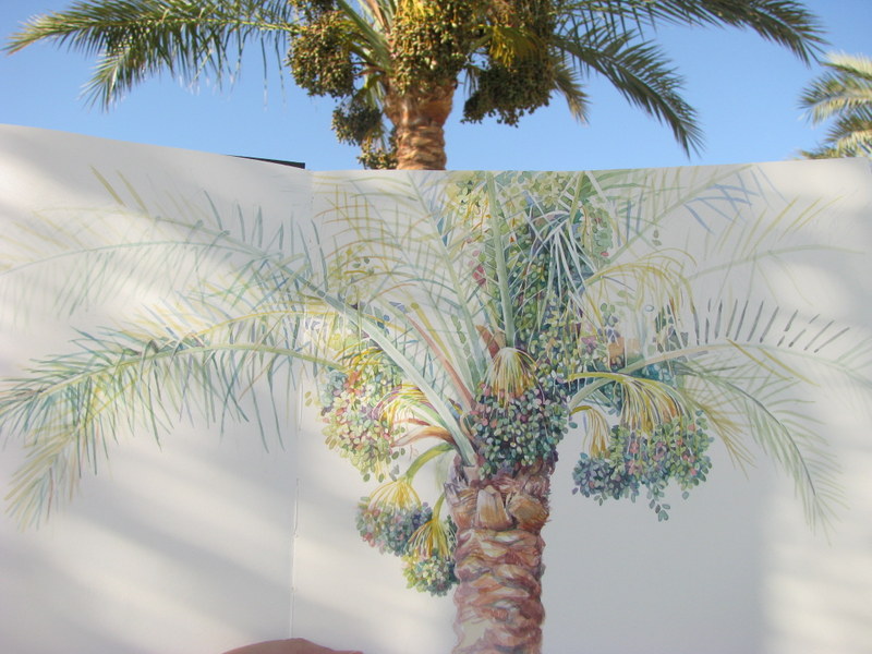
I'm dreaming of warmer weather and painting outside
School has finally ended and for me that means only one thing … Egypt. This year I’m going back with added purpose, because I will finally start on my next project, my RHS paintings.

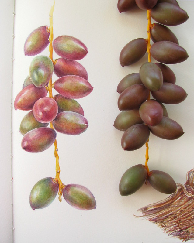
Last year I applied to the RHS and to my amazement, I received a letter saying that my work is suitable for an RHS exhibition! I now have five years to complete a set of paintings on a theme of my choice, and I know exactly what I would like to paint! It has to be the date palm, Phoenix dactylifera. Our garden in Egypt is full of them, and I just love painting them.

Sketchbook studies
Ripening dates

However I need to plan this out very carefully. I need a minimum of six paintings for the RHS and these paintings must work as a coherent exhibit. So my first consideration has been what paper to use, and what size the paintings should be.
I have been really fortunate to have met some amazing artists in recent months and have asked them all about their paper choices. Katherine Tyrrell was a great help- not only has she written a great series of articles on RHS winners, but she also took the time to go around the SBA exhibition with me and talk to me about size.
It appears that size DOES matter after all.

Struggling to make it fit on an A3 paper. 

Gael Sellwood was also a great source of information- she recently won a gold medal and also Best at Show at the RHS in Malvern. After our conversation, I decided that I would ditch the Fabriano Classico which I had been using since my SBA student days, and go for the better quality Fabriano Artistico.
My good friend Dianne Sutherland wrote an excellent blog post on all the papers. An RHS medallist herself, she too favours the Fabriano Artistico. Finally Sarah Morrish wrote a great piece comparing all the papers , and even gave me a few samples to try out at home.

So this week I took the plunge and  bought what seems an absolutely enormous roll of Fabriano Artistico 300gsm paper. By chance I found that the cheapest place to buy the paper was on my own doorstep at K&M Evans in Dublin. They were significantly cheaper in price than the UK companies.

My enormous roll of Fabriano Artistico dwarfs the A3 Fabriano Classico that I've been using. Below is the  tube which at 75cm wide. just fits into my suitcase.
Oh the thrill of all that paper! It’s a massive 140cm wide and 10 metres long, which, when you consider that I’ve been working on paper that’s 29.7x42cm (A3), seems quite daunting. I have been struggling with this restrictive size, so it will be a welcome relief to be able to work on a bigger area! The nice folks at K&M Evans also gave me a tube for travelling. I will have to cut some of the paper down to 75cm in order to fit, but at least the paper will be survive the numerous plane journeys ahead!

Completed study page 2013
I’ve also been making the slow switch-over to buying pans instead of tubes of watercolours. I had never really given the whole pans vs tubes debate much thought before, but read a fascinating post by Janene Walkky about the difference. What a revelation! 
Having pans of paint also meant that I am less likely to run into problems when travelling. I hate having to put my paints into my suitcase and into the hold of the plane. I can survive without clean clothes or even toiletries, but if my suitcase was lost with my paints inside, I would be a very grumpy artist indeed!

Date tree study, laden down with fruit 2013
It was also time to think about brushes. I really love my Winsor & Newton series 7 sable miniatures, but it seems that recently everyone has been raving about the Rosemary& Co brushes. I put in an order for some spotters and some ‘cat’s tongue’ filberts and was delighted to find that not only are they a better price, but they were delivered incredibly promptly too. 

New brushes!
So that’s it. I’m all set for the long journey ahead and hopefully a very pleasant summer of painting. I’ll need a week or so to get myself settled and the internet sorted, so there’ll be a short break in the blog posts until then.

I’m ready for a new adventure!

"There is joy in feeling the bristles of a quality brush, seeing the richness and lush color of truly good pigment flowing onto the paper or canvas. The cheap stuff just makes for harder work and lesser results."
 ~Gene Black

Friday, 6 December 2013

Vellumptuous


We keep moving forward, opening new doors, and doing new things, because we're curious and curiosity keeps leading us down new paths. (Walt Disney )

Iris foetidissima study on paper

 Last week was one where life’s distractions kept me away from the easel, and although it was great spending time with family, I was eager to get back to my art work. Fortunately the Iris foetidissima is a patient plant, and although the leaves had yellowed slightly, the seed pods last quite a long time.

The first thing that I needed to do was sort out the colour of the leaves, so I made up a small green colour chart and tried some different mixes. I wanted to keep the greens quite fresh as they made a nice contrast to the dried stalks and wispy bracts, so I substituted some fresher leaves for the yellowed ones of my subject. It’s always better to replace a leaf than to revert to using a photograph of how it looked when you started. 

Some messy sheets with possible colour mixes written out and different mixes used.
A colour chart like this quickly shows me the right mix to use. Here I found that winsor yellow+ perylene green, with cerulean and indigo, were the best match.
I liked how some of the leaves had holes and yellowed tips... my little bit of Wabi-sabi, the Japanese art of celebrating beauty with all of it’s flaws.Wabi sabi recognizes that all life is in a constant state of change and that decay is as much a part of life as growth.

So having worked out my colours, I finished off the little study that I began the other week.


At last, it was time to start on the vellum. Before I started on my larger piece, Dianne suggested that I first do a small study on the goatskin parchment that I have. It’s thinner, rougher and more transparent than the kelmscott vellum, and when you hold it up to the light, you can see all the pores. However it would allow me to try out the new techniques that I have learned  and give me a feel of what it is like to paint on vellum.

I await joyous surprises while working, an awakening of the materials that I work with and that my spirit develops. (Odilon Redon)

I felt a little like the beginner at the ice rink… you know the one who clings desperately to the edge, taking short faltering steps whilst hopelessly trying to stay upright. I started first with a few squares of flat washes, graded washes, dry brush and stippling. So far so good. But just as the novice ice skater gains a little confidence and takes a step too big, and crashes to the ground, I tried to put on one wash too many and soon found that I was inadvertently lifting paint with my brush and ruining my lovely first washes. Sigh!

However, if at first you don’t succeed, try again!
I drew the seed pod out on tracing paper first, then carefully went over in black pen, refining the image. Then I redid the lines with a HB pencil on the reverse, and then transferred the drawing onto the vellum by going over the lines once more with a sharp H pencil. Just don't press too hard!
 "Imagine that you are painting an butterfly's wing which would tear if you were heavy-handed"  (Margaret Stevens, former president of the Society of Botanical Artists)
Carefully, cautiously I began to paint.
I love my magnifiers!
Tucked away in my cozy studio, I soon found myself absorbed in the task of gently building up form and texture with layers of paint. The trick it seems is to use very little water and not disturb the layers underneath. 

My very dry palettes of paint. I used to use watercolour tubes but am slowly switching to pans as they contain more pigment, last a lot longer and are easier to travel with.  Janene Walkky wrote a great blog post on the subject which made me really think.
I found the new brushes (Winsor &Newton Series 7miniatures) wonderful for this. They held just the right amount of paint and kept a nice shape. As I paint, I like to listen to audiobooks and this week started The Goldfinch by Donna Tartt, which I have to say is brilliant, full of plot twists and turns. Tucked away in my quiet little sanctuary, I painted away, lost to the world… what bliss!


Taking shape... carefully!!

My desk... with everything that I need within easy reach
Almost there!

The final stage is to lay a sheet of tracing paper over the almost finished piece and with a pencil, work out which parts need darkening, as I have done on the lower left. I then use this as my guide for the final washes. Somehow the tracing paper makes it easier to read the tones.
I enjoyed working on the vellum… it imbues a softness and rich intensity to the pigments that you just can’t achieve on paper. "Vellumptuous" is my word to describe it. My mother is a gilder and art restorer, so I am now thinking about trying out some gold leaf and creating some illuminated botanical art on vellum. 
Wouldn’t that be fun?
However, first things first! My kelmscott vellum awaits! Having put so much time into preparation and practice, I feel a lot more confident with this one.

Iris foetidissima seed pod study on goatskin vellum
“The object isn’t to make art, it’s to be in that wonderful state which makes art inevitable.”  
Robert Henri