Monday, 16 February 2015

Art and Friendship

“In the sweetness of friendship let there be laughter, and sharing of pleasures. For in the dew of little things the heart finds its morning and is refreshed.”
Khalil Gibran

They say that art is a solitary pursuit, and it’s true that we artists spend many hours alone in our studio quietly painting. However the more that I paint, the more I realise that there is a wonderful social side to art. It’s about connecting. We paint because we want to show the world what we see. 

Scarlet Tiger Moth by Claire Ward
Sharing the results of our creative endeavours with others, makes art all the more pleasurable.
Just as a flower needs sunshine and water, we need a little bit of encouragement and friendship to grow.

 Eyed Hawkmoth (Smerinthus ocellatus) on vellum by Dianne Sutherland Ball

Thankfully connecting with others is easier than ever. The internet has literally thrown open the doors of our studios, allowing us to engage with likeminded people on a daily basis. I am constantly amazed at how generous people can be with their time, thoughts and advice. Their enthusiasm for art and passion for nature is both inspiring and motivating. I am constantly learning from them and discovering new things. 

Thistle on vellum by Sharon Tingey
Best of all, I have made some really fantastic friends through art. It brings me such joy to see their paintings and to hear about the projects that they are working on. When a friend achieves success, I share in their excitement. When I put up images of my work online, they in turn give me encouraging and often insightful feedback. Even when things aren't going to plan, there is always someone will always be ready to offer advice or suggest a solution.

A wonderfully thoughtful parcel of gifts that arrived unexpectedly last week. 
Being part of a vibrant online art community is an incredibly rewarding experience. I'm delighted to say that it's not just online too. I have been getting all sorts of treats and surprises in the post- paints and brushes, natural treasures, papers, books and even some beautiful art. Art swaps are also a great way of making friends and sharing that creative spirit.

"It's a wonderful thing being able to paint together all the time and grow as artists together." 
Scott Burdick

Three sketchbooks from the Natural Sketchbook Exchange. One of the artists has made some beautiful covers for each book
Art can also lead to some wonderful collaborations. I'm thrilled to be part of the Natural Sketchbook Exchange which a group of talented friends started a year ago. The concept is simple- we all started with a Stillman & Birn sketchbook, took our inspiration from Nature and then posted it on. 

Terri Dauncey's beautiful sketchbook and my page of feathers about to be stuck in!
Isn't this amazing? A beautiful page of flowers and a little landscape by Giovanni Cera in Terri's sketchbook

Beautiful birch trees by artist Lorraine Adams with my page of prickles
Debbie Crawford's lovely raspberry ripple peonies in Lorraine Adam's sketchbook

Inspiring work by Aislinn Adams in Dianne Sutherland Ball's sketchbook

My conkers about to go into Dianne Sutherland Ball's sketchbook
Watching the sketchbooks slowly fill up with artwork has been such a thrill, each one is so unique and special. Recently we took a short break just to give ourselves a chance to catch up with our lives, and that's why I have ended up with three of gorgeous sketchbooks here in my home.
Oh, they are such a joy to look through! I’m reluctant to part with them, but have the excitement of getting the next one in the post very soon.

A calendar and a card from Elizabeth H Tudor
And even as I write this blogpost, I hear a knock at the door, and another parcel has just arrived! This time it is from Canada with a lovely calendar and a card. Thank you Liz! What a fantastic surprise!

Art is not just a solitary pursuit, it’s definitely a social one too. It has made me realise that I am truly blessed with my friends. To each and every one of you, thank you for the kind words, the encouragement, the advice, the good wishes, the art, the gifts and for the smile that you put onto my face each day.

"I cannot even imagine where I would be today were it not for that handful of friends who have given me a heart full of joy. Let's face it, friends make life a lot more fun."
Charles Swindoll


Monday, 9 February 2015

Conkered

Per aspera ad astra-
Through difficulties to the stars

There has been a battle in my studio this week. Whilst my paperwork mountain was slowly being tackled, a little conker  sat on my desk, patiently awaiting my attention.
 I love painting conkers(Aesculus hippocastanum). I don’t know whether it’s the rich earthy colours or that tactile smoothness, but they make the perfect subject.

My page of conkers has now been stuck into Dianne's sketchbook for the Nature Trails Sketchbook Exchange
 I have painted them quite a few times now, but always on paper, never on vellum. I did try once, but gave up in exasperation. To get that rich patina you need quite a few layers of paint, and that can be a challenge on vellum. Suddenly you can find that you’re lifting paint off instead of adding another layer, and the more that you try to fix it, the quicker it turns into a blobby, patchy mess.
However, undeterred by the last disaster, I began.


I was feeling confident. I threw on a few initial washes of colour.

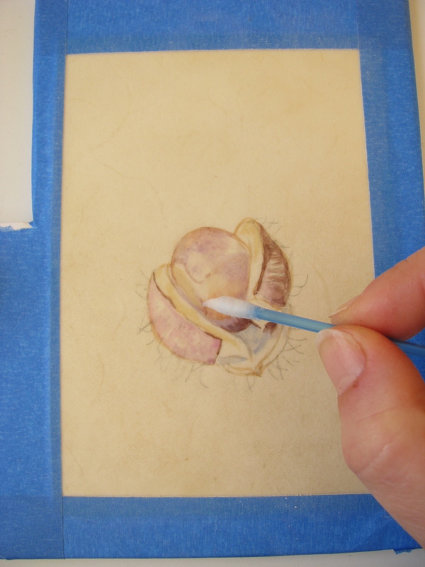
It wasn’t long before I was trying to fix things using a dampened cotton bud. Because the paint sits on the surface of the vellum, it's easy to wipe off. Perhaps a little too easy.

 However as I progressed, it became apparent that I had not put in enough blue in my initial washes, essential for that convincing gleam. I began to fuss, and it quickly became a horrible mess. I tried to scrape some of it off, but this is natural calf vellum, not kelmscott, which has a chalky coating, and so I ended up scuffing up the surface. The paint got caught in it and stained, leaving a dark and horrible patch. I wiped as much as I could off.

Attempt #2- I have to disguise that horrible dark patch
I decided to start again, but moved the conker up on the vellum to cover the recriminating patch. This time, I decided to start on the polished conker, ignoring the prickly cases.


Sometimes starting again can be the best option. You are aware of the mistakes that you have made and so take care to avoid them.


The colours that I used this time were similar to the ones that I used before, but with a few changes. I used Indanthrene instead of Cobalt and avoided Indigo altogether. For my really dark darks, I used Perylene violet with a little Perylene green. I also used a tiny bit of Transparent Brown Oxide and Burnt Bronzite from my Daniel Smith dot charts for the shell.


I ran out of daylight hours in my haste to finish this, so the photograph of the finished piece is not the best. I’m quite pleased with how it turned out though and glad that I persisted.


Today I was given some glorious lilies, exuberant beauties that are just begging to have their portrait painted. My palette will be washed, the earth colours put away and those delicious purple pigments will be coming out to play! Even the paperwork pile is looking less daunting.

That which we persist in doing becomes easier - not that the nature of the task has changed, but our ability to do has increased.” 
Ralph Waldo Emerson

Sunday, 1 February 2015

Seeking Balance

Beauty is a Fragile Gift
Ovid

This week has been one of those weeks where Time has been in short supply.

Even as I type this, a large pile of papers and forms sit in reproachful silence beside my desk. I have managed to get through some of the more urgent ones, like registering for VAT in the UK. I've even sent off the necessary forms for exhibitions that are coming up, but I still have an enormous mountain of paperwork to sort through and deal with. It's quite disheartening.

It would be so tempting to just climb back into bed!
As always Painting is my lifeline, my escape and the key to my sanity.

“It is the process of doing art that reduces stress and puts us in that 'zone' of spiritual connection.” Diana S. Boehnert

In order to establish a bit of balance into my life, I try to make a conscious effort to always have a little painting on the go. The best subject in busy times is one that can happily sit on my desk whilst I deal with all the tedious stuff, something that won’t wilt, fade or change too much. Allowing myself a few hours to paint is my reward for doing a few hours of paperwork. 


Last week a friend sent a small piece of natural calf vellum from Pergamena and I couldn't wait to try it out. The first step with vellum is to tape it down. Being a natural product, it has the tendency to warp and bend with a little bit of humidity. I found that the Scotch blue painters tape works really well.


To get rid of any residue oils or greases, you prepare the surface by gently rubbing with fine pumice powder. I bought mine in Cornelissen’s in London. I popped some into a footsie and used gentle circular movements. You can also use this powder to take off the paint if need be.

 I sketched it out onto tracing paper and transferred it onto the vellum. Although you can draw directly onto the vellum. graphite can mark the vellum and it's better not to mess with the delicate surface too much. I've noticed that an eraser can leave marks.

Ready to go!
I must admit that when I got around to the painting, I stopped in my tracks. I had looked at the skeleton and thought that it seemed a simple enough subject… sure, it was mainly holes. What could be easier? Except how on earth do you paint a hole?


The answer is to take a big breath, and using very fine brush, a big magnifier and some washes of W&N cobalt violet and cerulean for the shadows, Add a little bit of natural sienna (Daniel Smith), raw umber (DS and W&N), W&N Light red and DS cobalt ...and slowly, slowly build up the shapes. 


For the fruit I used winsor orange, perylene maroon and perylene violet. Surprisingly, this part was  the easiest. It was just a matter of painting the negative shapes between the veins. There was a little bit of negative painting both at the top and the base of the skeleton too, where the shapes overlapped.

It was a very welcome distraction to the tedium of form filling. I still hate paperwork, but at least by allowing myself a little art, I am slowly making my way through this pile.  I should really have written this blog earlier today, but I looked at the lovely sunshine streaming through my studio window and thought, Life is really just too short! So I have another little painting set up and started on my desk. The bookwork can wait until tomorrow!

My temptation awaits...
“Only Robinson Crusoe had everything done by Friday.”

Anonymous

Sunday, 25 January 2015

Confessions of a Colourholic

Colour! What a deep and mysterious language, the language of dreams.”
Paul Gauguin

I am addicted to colour. Yes, I am admitting it. Colour thrills me
There once was a time when a small pocket palette of twelve colours was enough to satisfy the colour junkie in me, but no more! 
My collection of watercolour paints has slowly grown over time and I still want more!

Is there such a thing as too many paints?
A friend very kindly sent me some Daniel Smith dot charts this week which had me swooning! (Thank you M!) If you haven’t yet discovered their wonderful range of paints, then it’s definitely worth trying a dot chart. There is just enough pigment to whet your appetite and leave you craving for more.

Daniel Smith dot charts, M Garham paints, Pergamena vellum... heaven!
I'm a big fan of Winsor & Newton watercolours, and Schmincke Horadam paints are also fabulous. I have  just been sent my first couple of M Grahams. Apparently they are made with blackberry honey so that the paint flows beautifully... mmmm!!  The same colour can vary a lot from brand to brand, so of course, I will have to get one from each. 
It’s FOMO, that Fear of Missing Out… the thought that there might be that one elusive hue that will cure all your pigment woes!


With so many tubes and pans of paint, it’s impossible to remember the characteristics of each, so I have got into the habit of making colour charts. Sometimes I paint them into sketchbooks, but I’ve found that making them on small pieces of watercolour paper works best. They can be pinned on the noticeboard in front of me whilst I work, or stuck directly onto my easel, or even carried with me when I go out and about. When sketching outside, you might not always get a chance to paint, but at least you can colour match and make a note. 

These fresh dates are photographed alongside the corresponding colour charts 
Colour charts are also handy if you need to take a photograph of your subject. Photography can change the colours, but with a colour chart nearby, you have a guide as to the true colour of the subject.
My colour charts are often made of  little squares of pure colour. I tip the paper after I paint the square so that the paint falls to the bottom. That helps me see the characteristics of the paint, such as if it is transparent or opaque, granulating or glazing. 

I use a template from Rotring to draw my squares which saves time.

The charts that I seem to use most are my earth pigments. I can see at a glance what to use.

I also make charts of mixes. My general rule for mixes in colour charts is to only have two pigments. When I paint, I might add in a third, but it makes life easier to keep the colour chart simple. I have some earth ones- lovely mixes of greys and browns which are very useful. 


I sat down one afternoon and made a Mother of All Blacks colour chart. It was a cold, dark rainy afternoon, no good for painting, so I experimented to see which colours made the best blacks. To my surprise I found that my least favourite colours, Hookers and Viridian, made the most divine chromatic blacks, particularly when mixed with colours like Winsor dioxide. Honestly, these are the paints that rarely saw the light of day, but now I look at them with renewed respect!

What a wonderful surprise!! The full chart can be seen here.
Of course, the colour that truly drives most botanical artists demented is green. It just HAS to be mixed. I’ve yet to find a good green from a tube. I often hear people grumbling that their greens always look the same, and when I ask them if they have made a green colour chart, they say no.
How on earth can you discover which combinations make the best mix if you haven’t tried them all out? Yes, it’s time consuming, yes, it is tedious, but it’s well worth the effort.


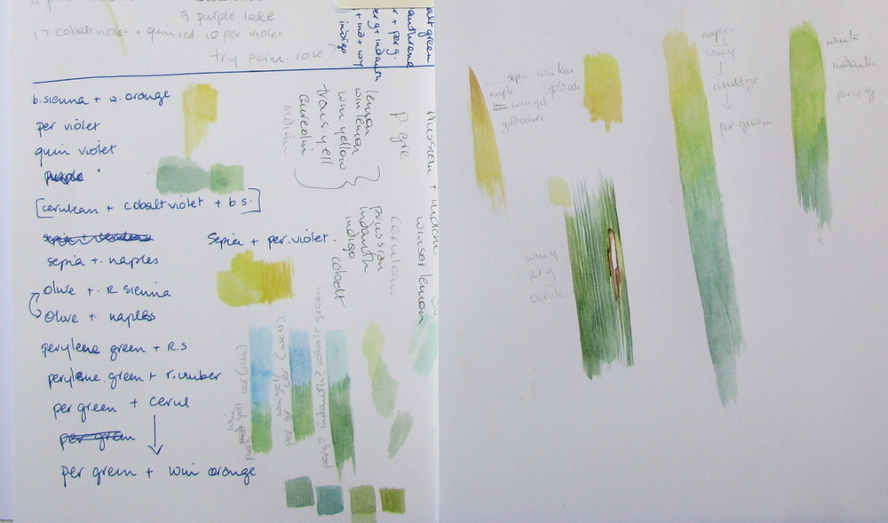
Usually with greens, you need to add a smidgen of red, pink or purple to tame it. However to make a green colour chart, it’s best to stick to the two main ingredients. I put yellows down one side and blues and greens down the other. That will give me an idea of what to use. I will add the tamer (pink/red or purple) later when I go to paint the leaf.


A number of people have asked me about the colour charts in my sketchbooks. Sometimes they are just charts of all the possible colours to help me decide what to use. Often they are simply reminders of what colours I eventually settled upon.

Playing with possible reds and trying to see which what happens over a yellow base, and recording which greens have worked
When I have finished a study, I write down all the colours that I have used, and the combinations, often on a messy scrap of paper. It’s such a useful habit to get into. I very quickly forget what colours I have used, so writing them down saves a lot of time and frustration.

Yes, I do scribbly pages too!
The most useful thing about making a colour chart is that it is the best way to break an artist’s block. Every artist loses their inspiration from time to time, but a colour chart is a bit like doing musical scales on a piano. They don’t take a lot of thought, but the chances are that once you have got those fingers warmed up and the paint flowing, you’ll begin to make exciting discoveries. That urge to create will return.  Go on, pull those paints out!

As Paul Klee said “Colour is the place where our brain and the universe meet.”


“Colour is the keyboard, the eyes are the harmonies, the soul is the piano with many strings. The artist is the hand that plays, touching one key or another, to cause vibrations in the soul.”
Wassily Kandinsky


Sunday, 18 January 2015

The Sensitivity of Things - Mono no Aware 物の哀れ


Painting can be a journey of the mind. 

I have been contemplating the transience of life as I painted the little dead snipe this week. 
I came across a beautiful Japanese phrase Mono no Aware  物の哀れ (moh-no no ah-wah-ray), which roughly translates  as “the sensitivity of things”.
It refers to an awareness of the fragility of existence, an appreciation for it’s beauty and the gentle sadness of it’s passing.

Looking closely at a life that has passed
The term was coined in the 18th century by the Japanese literary scholar Motoori Norinaga to describe the essence of Japanese culture, but it remains popular as a concept in Japanese culture even today. An example of Mono no Aware would be the Japanese love of the cherry blossom. Every year crowds of people go out to sit beneath and admire the cascades of snowy blossoms, poignantly aware that these blooms will only last a week. Similarly a snowy landscape, the waning moon, the plaintive call of geese, even the ripples on the water of a lake can also evoke feeling of Mono no Aware.

Mono no aware is about the transience and bittersweet nature of life.


My snipe painting is also an example of Mono no Aware. I considered painting the snipe as if he were still alive, but decided that even death has it’s own quiet beauty, and so I chose honesty instead.
 Far from being morbid subject, it felt like such a rare honour to be able to study the beautiful patterns, colours and structure so intimately. The only thing that I recreated was the eye, which had not survived the nightly freeze.


There is transience even in death, and throughout the week I noticed the subtle changes, the slow decay. I’m glad that I made the colour notes for his legs the week before because they were the first to change. By the end of the week, the snipe was no longer looking his best.

Gallinago gallinago,  watercolour on paper  © Shevaun Doherty 2015
A dead bird is not the most obviously beautiful of subjects to paint, but I wanted to capture the evocative wistfulness of the moment. The Japanese believe that beauty is not inherent in an object, but only comes to into being when it is seen and appreciated. 
I hope I evoked that beauty.

Scarlet Tiger Moth  by Claire Ward
Another beautiful object arrived at my home this week. My friend Claire Ward sent me a stunning painting of a Scarlet tiger moth on handmade paper. Her work is exquisite- have a look at her website. It seems that like me, my friends are also stirred by the beauty and precious fragility of life.


"One's feelings are stirred up because he understands, deep in his heart, the moving power of the moon and the blossoms. The heart that is ignorant of this moving power will never be stirred, no matter how wonderful the blossoms are and how clear the moon is in front of him." Motoori Norinaga (1730-1801)


Sunday, 11 January 2015

The Slow Approach


Plan like a turtle; paint like a rabbit.
Edgar A. Whitney

Sometimes starting a painting can be so daunting because there are so many aspects to think about. So I’ve become a bit of a plodder. Rather than dive in, I’ll take the slow approach and happily spend a few days just getting to know my subject first.

Flowers get pulled apart and painted petal by petal.  

Leaves are placed on the page and painted over and over again until I’ve found that perfect green mix. Just the simple pleasure of painting little squares of colour can make me feel like I’m accomplishing things.

It’s not just botanical work that is given this treatment. This week I have a dead snipe on my desk. 


A friend called me to say that she had found the poor dead creature and had kindly popped it into her freezer for me! Some of the snipes here in Ireland are winter visitors from Faroe Islands and Iceland. Never having seen a snipe in real life, I was both intrigued and excited. 
Curiosity overcame any squeamishness.

Thursday, 1 January 2015

Plans, Paintings and Promises 2015

I never make New Year's resolutions, but writing a plan at the beginning of last year seemed to set the pace for the year ahead. Although I didn’t quite manage to do everything on my list, just having a positive approach can make all the difference.
 So here goes-


1. Positive steps towards promoting my art


Please pop along and have a look!  https://www.facebook.com/shevaundohertyart
I have been dithering about promoting my artwork for far too long. This blog was my first step forward and it has definitely helped me to gain confidence as an artist. So this year I am taking the next step. I have just set up a Facebook Page for my art. Now I will work on getting a website up and running.


2. Exhibitions to Aim for

What is an art plan without exhibitions?