Last week, I went to visit an artist friend who has a small but
exquisite
garden, lovingly tended and filled with all manner of botanical
treasures. She gave me some seed heads for my next painting project, and then almost
as an afterthought, gave me some of the lovely black leaves and berries of
Ophiopogom planiscapus 'Nigrescens’ or black
lilyturf. I took them home, popped them into jam jars, planning to begin work
on the seed heads once the weekend was over.
But all weekend long, my thoughts kept slipping back to
black.
 |
| Jacaranda seedpod |
It’s such a powerful and evocative colour, but one that most
watercolour artists tend to avoid. In fact, it’s one of the few colours that I
just don’t have in my box of paints. To be honest, I haven’t really had much
use for black. I searched through my sketchbooks to see if I had used it in the
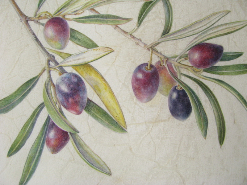
past, but found just a page of olives, a jacaranda seedpod and a tiny scarab
beetle.
 |
| Plein air study of an olive tree and olives, Cairo |
Black paint can either be bought readymade, or created using
mixtures of the three primaries. Of the commercial blacks, Lamp black is made
from the soot of oil lamps (a rich velvety opaque black), whilst ivory black is
made from crushed roasted ivory or bone (a warmer less intense black). There
are also neutral tints (first developed by 18thcentury English
watercolourists as an alternative to sepia) which are used to “neutralise” the
intensity of the hue. Winsor and Newton’s neutral tint is actually a mix of
lamp black, dark blue and violet. Payne's grey, another popular neutral tint, is a mixture of iron blue, yellow ochre and crimson
lake.
 |
Little scarab beetle painted using mainly Payne's grey, and a pectoral in the form of a scarab from Tutankhamun's tomb
It is generally agreed that the best blacks of all
are the chromatic blacks, created by the artist by carefully mixing primaries.
Ask a dozen artists their favourite chromatic black, and each will give you a
different recipe of pigments.
|
 |
| A word to the wise... this is best done on a day when it's too dark to paint and too wet and cold to go out! |
So, with all thoughts of the work that I should be doing
cast aside, I found myself on Monday morning making the “mother of all black
charts”. Not a quest for the fainthearted, but by the time that I had finished,
I had made some very interesting discoveries.
·
- Hookers green, a pigment that I have really disliked up until now, made the most gorgeous range of dark earthy greens
- Viridian and Perylene green both made a delicious range of blacks, especially when combined with Winsor dioxide.
- Perylene maroon also came up trumps, better even than alizarin crimson, creating some beautifully rich colours.
You can read more about pigments and their qualities
here
So having satisfied my curiosity somewhat, I started to paint
the Ophiopogom. As it was only a study,
I decided to throw caution to the wind and just dive in without a lot of
preliminary sketches. I loosely arranged the leaves and berries onto a sheet of
paper (using blu-tack to hold them in place), took a photograph to remind me of
the composition and popped the leaves and berries back into the water to keep
them fresh.
The berries are a beautiful blueish black. I mixed cerulean,
cobalt violet and paynes grey to get the lightest colour, adding indigo and
winsor violet to get the richer tones.
 |
| I draw the berries out carefully in pencil and then paint the lines in a paler version of the finished colour |
The leaves go from a gorgeous pale
yellow to green to a rich inky black … a fantastic combination of colours! I
started with naples, blending it into lemon and first adding cerulean to the lemon and then indigo, before blending that into perylene green. The upper parts
of the leaf were first given a wash of the cerulean/cobalt violet/paynes
grey mix, and then finished off with a mix of perylene green with winsor
dioxide and a teeny bit of perylene maroon. The veins on the underside were
painted with perylene green.
 |
| Ophiopogon planiscapus ‘Nigrescens’ (lilyturf). Although it looks like black grass, lilyturf is actually a member of the asparagus family (Asparagaceae). Planiscapus means ‘flattened scape’ and refers to the flattened flower-stalk of this species, as seen on the stalk on the left. |
Regardless of the mixes used, black flowers and plants make visually
striking and dramatic paintings. I really love Rosie Sanders paintings of black
flowers (
see here), and Coral Guest's
black tulips. Billy Showell’s gorgeous painting of
Tacca chantrieri (batflower) has both elegance and intrigue.
Yes, I will definitely be going back to black.
"There's something about black. You feel hidden away in it." ~ Georgia O'Keeffe