
“Colour! What a deep
and mysterious language, the language of dreams.”
Paul Gauguin
I am addicted to colour. Yes, I am admitting it. Colour
thrills me.
There once was a time when a small pocket palette of twelve colours
was enough to satisfy the colour junkie in me, but no more!
My collection of
watercolour paints has slowly grown over time and I still want more!
 |
| Is there such a thing as too many paints? |
A friend very kindly sent me some Daniel Smith dot charts
this week which had me swooning! (Thank you M!) If you haven’t yet discovered their wonderful
range of paints, then it’s definitely worth trying a dot chart. There is just
enough pigment to whet your appetite and leave you craving for more.
 |
| Daniel Smith dot charts, M Garham paints, Pergamena vellum... heaven! |
I'm a big fan of Winsor & Newton watercolours, and
Schmincke Horadam paints are also fabulous. I have just been sent my first couple of
M Grahams. Apparently they are made with blackberry honey so that the paint flows beautifully... mmmm!! The same colour can vary a lot from brand to
brand, so of course, I will have to get one from each.
It’s FOMO, that Fear of
Missing Out… the thought that there might be that one elusive hue that will cure
all your pigment woes!

With so many tubes and pans of paint, it’s impossible to remember
the characteristics of each, so I have got into the habit of making colour
charts. Sometimes I paint them into sketchbooks, but I’ve found that making
them on small pieces of watercolour paper works best. They can be pinned on the
noticeboard in front of me whilst I work, or stuck directly onto my easel, or
even carried with me when I go out and about. When sketching outside, you might
not always get a chance to paint, but at least you can colour match and make a
note.
 |
| These fresh dates are photographed alongside the corresponding colour charts |
Colour charts are also handy if you need to take a photograph of your subject.
Photography can change the colours, but with a colour chart nearby, you have a
guide as to the true colour of the subject.
My colour charts are often made of little squares of pure colour. I tip the paper
after I paint the square so that the paint falls to the bottom. That helps me
see the characteristics of the paint, such as if it is transparent or opaque,
granulating or glazing.

I use a template from Rotring to draw my squares which
saves time.

The charts that I seem to use most are my earth pigments. I can see at a glance what to use.
I also make charts of mixes. My general rule for mixes in
colour charts is to only have two pigments. When I paint, I might add in a
third, but it makes life easier to keep the colour chart simple. I have some
earth ones- lovely mixes of greys and browns which are very useful.

I sat
down one afternoon and made a Mother of All Blacks colour chart. It was a cold, dark
rainy afternoon, no good for painting, so I experimented to see which colours
made the best blacks. To my surprise I found that my least favourite colours,
Hookers and Viridian, made the most divine chromatic blacks, particularly when
mixed with colours like Winsor dioxide. Honestly, these are the paints that rarely
saw the light of day, but now I look at them with renewed respect!
 |
| What a wonderful surprise!! The full chart can be seen here. |
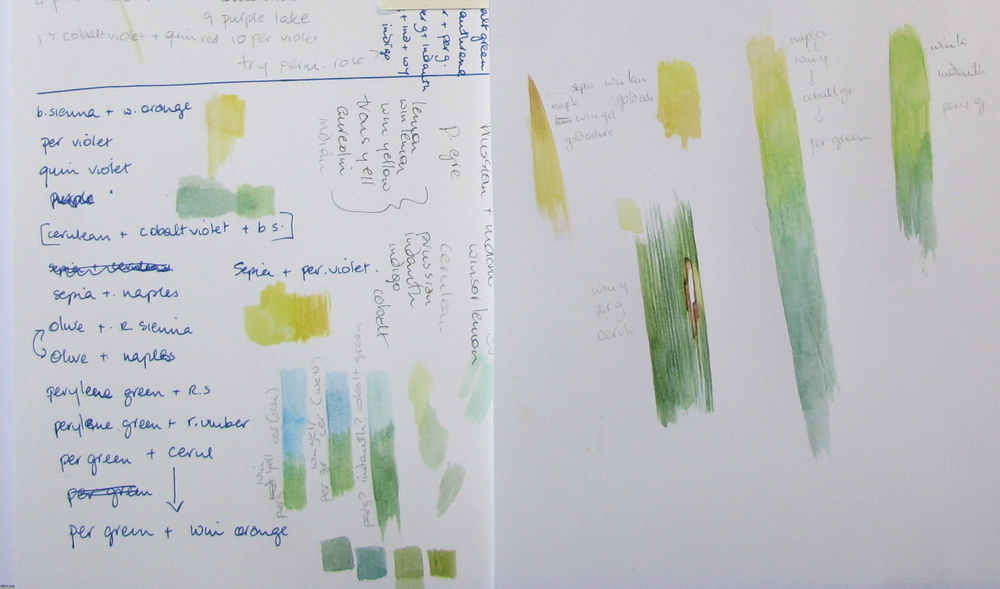
Of course, the colour
that truly drives most botanical artists demented is green. It just HAS to be
mixed. I’ve yet to find a good green from a tube. I often hear people grumbling
that their greens always look the same, and when I ask them if they have made a
green colour chart, they say no.
How on earth can you discover which combinations make the best mix if you haven’t tried them all out? Yes, it’s time consuming, yes, it is tedious, but it’s well worth the effort.
How on earth can you discover which combinations make the best mix if you haven’t tried them all out? Yes, it’s time consuming, yes, it is tedious, but it’s well worth the effort.

Usually with greens, you need to add a smidgen of red, pink
or purple to tame it. However to make a green colour chart, it’s best to stick
to the two main ingredients. I put yellows down one side and blues and greens
down the other. That will give me an idea of what to use. I will add the tamer
(pink/red or purple) later when I go to paint the leaf.


A number of people have asked me about the colour charts in
my sketchbooks. Sometimes they are just charts of all the possible colours to
help me decide what to use. Often they are simply reminders of what colours I eventually settled upon.
 |
| Playing with possible reds and trying to see which what happens over a yellow base, and recording which greens have worked |
When I have finished a study, I write down all the colours
that I have used, and the combinations, often on a messy scrap of paper. It’s
such a useful habit to get into. I very quickly forget what colours I have used, so
writing them down saves a lot of time and frustration.
 |
| Yes, I do scribbly pages too! |
The most useful thing about making a colour chart is that it
is the best way to break an artist’s block. Every artist loses their
inspiration from time to time, but a colour chart is a bit like doing musical
scales on a piano. They don’t take a lot of thought, but the chances are that
once you have got those fingers warmed up and the paint flowing, you’ll begin
to make exciting discoveries. That urge to create will return. Go on, pull those paints out!
As Paul Klee
said “Colour is the place where our brain and the universe meet.”

“Colour is the
keyboard, the eyes are the harmonies, the soul is the piano with many strings.
The artist is the hand that plays, touching one key or another, to cause
vibrations in the soul.”
Wassily Kandinsky
Shevaun, thanks for the great explanation of the colour charts.
ReplyDeleteI've been trying to make one with greens, didn't work. Now I know that is because I used more than two colours!
I'm going to try it again, this time your way.
(And also using a graphic tool for the squares, haha!)
Wishing you a great day!
Maria, my first attempts were horrible and so confusing too. It took me a while to work out how to make a decent colour chart. In fact I need to make a few new ones because I've added a few new pigments to my collection! Persist in your efforts because they are so useful to have in the studio.
DeleteGreat post Shevaun, your enthusiasm is inspiring xxx :)
ReplyDeleteIt's easy to feel enthusiastic when faced with so many lovely colours, Claire! Thanks xx
DeleteMy goodness what a lot of beautiful colours.
ReplyDeleteAren't they divine?
DeleteIt has made my day reading today's post. Thank you
ReplyDeleteI'm so pleased! Thanks
DeleteExcellent information. Yes, colour charts are very very useful. I keep mine, if they don't relate directly to a piece, in a separate ring binder. Enjoying exercise on a wintery day by the fire place with a glass of wine!
ReplyDeleteYou have your priorities right, Monica! Just don't dip your brush into the wine!
Deletei've always done charts and swatches (paper is all over the studio)
ReplyDeletebut now due to you guys i do more uniform ones instead of swipes and blotches
oh and i love mixing greens with oranges and reds.... most often i will underpaint with an orangey yellow or pinkish peach and go from there
Oh the possibilities are endless, Vi!!
DeleteWonderful post. Thanks for sharing.
ReplyDeleteCarmelle, thank you for taking the time to read and comment.
DeleteOh my, what a lot of work! I often want to make color swatches--but it seems so daunting a task. Now that you have shown how very useful they are, I may have to reconsider!
ReplyDeleteLaura, I tend to save them for the days when it's just too dark and miserable to work. Or for an evening when there is nothing on TV. I have found it useful to make notes of the colours that I've used though, and it does make the sketchbook page look more interesting 😉
DeleteYour post was a feast for the eyes! I approach my greens the same way with a chart with blues down one side and yellows down the other, then match the closest green to the foliage and add a dab of red to tone it down a bit. It helps to have a system, doesn't it!? Great quotes--they express so much about the joy of color.
ReplyDeleteJanene I was spoilt for choice this week with the quotes! There were so many wonderful ones!
DeleteI just cleaned out my studio in preparation for the upcoming season, and your fabulous post was my reward. Color charts are great, and my favorite paints are Daniel Smith, for too many reasons to mention. Thanks for all the effort you put into this post. Much appreciated.
ReplyDeleteEM- what a great thing to say! Thanks! I'm a recent convert to Daniel Smiths and they are just wonderful! I'll have to play with the dot charts this week. I'm almost afraid to because I know that I'll want even more paint! A clean studio? That sounds like you are preparing to paint!
DeleteOh boy, another colourholic!! Seriously Shevaun, we could be twins with it comes to colour. I have books and books and books of color swatches. So many in fact that I made a template of little square cut out quilter's plastic sheets (very thin). I did a video of how to cut them. I always make a color chart for each painting, my memory is so bad I'd never remember which colors I used. We need to do those dot pages huh? I just wouldn't know what to send you, you have so many tubes!
ReplyDeleteLaura, you're my sister from another mister. I know just how much you love colour. I only wish I had your amazing photoshop skills!! Let me think about the dot charts... I have the seed of an idea! 😉
DeleteWhat a great post! I thought I was the only one collecting all the colors there are, lol!
ReplyDeleteYou are so right about FOMO!
Carol, it appears that there are far more closet colourholics than I realised! Phew! We are not alone!!
DeleteHa perhaps we should start a Colourholics Anonymous group? I'm Polly and I'm proud to say... LOL I use the little squares at the top of the Fabriano pads where the ringbinder goes, to make my squares. Sheer laziness, but it works. The charts live in an A5 ringbinder unless I'm using them. I'm loving seeing your sketchbook pages again.
ReplyDeleteHaha, Polly!! You are one of the biggest colourholics that I know! Colour charts have you drooling, I know! That's a good idea about using the squares from the top of the pads. I'd love to see your color charts too (a possible blogpost from you perhaps?). Anyway I'm already dreaming of new colour charts-- a few people have mentioned blue+orange for green and I'm curious about it now!!!
DeleteGood stuff Shevaun thanks!
ReplyDeleteNella