Pages

Friday, 28 February 2014

Tick Tock

I can almost hear the ticking of the looming deadline. 

Yes, the Society of Botanical Artists submission day is fast approaching (17th March), and my paintings have to be finished this week and ready for scanning and framing. 
It’s probably not the best time to change the composition of a piece, but when I thought back to what initially attracted me to the Calamondin plant, it was the abundance of little oranges peeking out through the foliage. So this week I decided to throw caution to the wind and add some more fruit.

Hmmm... what would a little extra fruit look like? Perhaps this small orange will fit?
Thank God for tracing paper! It really is the easiest way to ascertain whether something is going to work or not. You can try out new ideas without too much effort, just by using coloured pencils on tracing paper.

First one little fruit

Then another

And why not two more?

Anyway, the painting is finally finished!!! I am pleased that I had decided to add more fruit as I felt that it added depth and interest to the composition. Besides I needed a break from all those green leaves!

× Citrofortunella microcarpa,  Calamondin or Chinese Orange
watercolour on vellum 30x23cm 2014

Of all the paintings that I have done, I think this one was one that I learned the most on. Dianne has been a brilliant mentor and great support. If you are interested in painting on vellum, I'd really recommend doing a course because there is definitely a knack to it. Anyway, here's what I've learned-
  • ·        Dark shiny leaves are difficult to do on vellum, but not impossible. I’m just going to try to avoid them in future.
  • ·        Greens need a lot of pink (thank you Jess for reminding me of that)
  • ·        Sometimes it’s better to remove the paint and start again, than trying to fix something that is just not going to work
  • ·        Pumice powder, a damp paintbrush or a scalpel will all remove paint, but a damp cotton bud is like a magic wand (I have to give credit to Denise Walser-Kolar for that brilliant tip, it made such a difference)
  • ·        Beware the scalpel! That sounds a bit obvious but I got a bit carried away at one stage and ended up with a big scratch on the surface of my vellum. It's a bit addictive
  • ·        Be brave. Don’t be afraid to make changes if you feel it is necessary
  • ·        Always have a good supply of tracing paper
  • ·        Remind yourself of what first attracted you to the plant and try to capture that in your painting
  • ·        Dry brushwork is tough on paintbrushes. My miniature sable brushes are completely worn out now after completing these two vellum pieces


My no2 and no3 are stumps beside my no4. Time for new brushes!

There’s no rest for the wicked though. The Nature Sketchbook Exchange project continues, and with that deadline also approaching, I need to clean off my palette and get started. Exciting times lie ahead.

The best way to finish a painting is to start a new one” 
Sylvio Gagnon


Saturday, 22 February 2014

Wicked

This week was WickedThat is to say, that whilst I painted this week, I listened to the audiobook of Wicked, the fantastic novel by Gregory Maguire about the Life and Times of the Wicked Witch of the West.

Wicked
“Books fall open, you fall in. When you climb out again, you're a bit larger than you used to be” 
Gregory Maguire
If you haven’t read it, do. It’s such a clever and completely spellbinding story, and as I followed the twists and turns of the wonderful green-skinned heroine, Elphaba, I too was immersed in greens. And like Elphaba, I found that greens are made up of many layers and need to handled with great care and infinite patience.

 
Not even a healthy dose of imagination can bring these leaves back to life!
The week began badly. After an exasperating weekend of putting paint on and then taking it off (don’t ask!), I awoke on Monday to find that my leaves had decided to curl up and die. I was very tempted to throw in the towel and start afresh, preferably with something which didn’t involve the frustrating task of painting dark green, shiny leaves on vellum.

I could have tried to paint the leaves from my reference photographs, but it’s never quite the same as painting from life. It’s strange to realise that fact, because when I first began to paint in watercolours a few years ago, I would have thought nothing of painting from a photograph. However nothing beats having the real thing in front of you. 


So I carefully selected another branch from my Calamondin tree, trying to match up the leaves in terms of size and redrew the composition. To my surprise, I found that I actually preferred the new composition… the leaves were perkier and added a fresh liveliness to the layout. Even the sun came out to add a little dazzle.


I also finally figured out my green formula. I’m taking note of the colours because if you ask me what paints I used in a month’s time, I will look at you blankly.

The greens take a lot of layers, a light hand and infinite patience
The palette set out ready for action. I didn't use all the colours in the little wells. I have a second palette to the side with my oranges and pinks.
Lemon Yellow, Cerulean, Indanthrene, New Gamboge, Permanent Rose, Sap Green were the main colours used. I usually use Winsor and Newton paints, but also have a very nice Schmincke cerulean which is quite transparent.
So the painting progresses, and Dorothy is just about to kill the witch in the mistaken belief that she is wicked. I have a few surprises myself up my sleeve. I’m so glad that there’s a sequel because there's a lot more to do on this painting!! Right, I'm off to Oz.


“Green is the prime color of the world, and that from which its loveliness arises”
 Pedro Calderon de la Barca

Friday, 14 February 2014

Escaping to the Studio

Art is the only way to run away without leaving home.” Twyla Tharp

I’ve always loved this quote because art truly does provide the means to escape. This week I have been busy in my studio painting oranges. My little heater and daylight lamps give me all the warmth and brightness I need, and an excellent audiobook The Luminaries, has captured my imagination and transported me back in time to the 19th century whilst I paint. 

My warm bright studio... a haven from the wild wintry weather outside
The little oranges have helped too- such a sweet little fruit. I find them so evocative of the warm Mediterranean climate. Apparently there are over 35 million orange trees in Spain alone! 

However my little calamondin oranges (Citrofortunella microcarpa) , like most citrus fruit, orginated in Asia where they were first cultivated in 4000 BC. By 200 BC, the Romans, impressed with the nutritious fruits and fragrant evergreen trees were growing them in their gardens. The health benefits of the fruit were so well known that Portuguese, Spanish, Dutch and Arab sailors planted citrus trees along the trade routes to help prevent scurvy. Christopher Columbus is said to have brought citrus seeds with him on his second voyage to the Americas in 1493, and considering that Brazil is now the world’s foremost producer of citrus fruit, it’s fair to say that they thrived in their new habitat.

The Garden of the Hesperides, c.1892 by Sir Frederic Leighton
  I've always liked this painting of the nymphs, languishing on a warm day beneath the mystical orange tree
Even in mythology, oranges have played a role.
Hera, the Greek goddess of Women and Marriage, and wife of Zeus, had a beautiful garden near Benghazi in Libya, in which grew a tree whose fruit had the power to bestow immortality. They are often referred to as golden apples, but later believed to be oranges. Three nymphs called the Hesperides were tasked with guarding the tree, along with a multi-headed serpent named Ladon. However one day the goddess of Discord, Eris, slipped into the garden and stole a golden fruit. She inscribed the golden fruit with the words “To the most beautiful”, and threw it into a wedding party from which she was excluded, and in the ensuing chaos, the Trojan Wars were started. You can read that story here


Linnaeus obviously believed that the "golden apples" were oranges too, as he originally gave the name Hesperideæ to the order containing citrus fruits.  All citrus fruit are are still known as hesperidium- a type of modified berry with a tough leathery rind which contains volatile oil glands. The juicy interior is divided into segments called carpels, each containing fluid-filled vesicles that are in fact, specialized hair cells. I bet you never realised that you were eating hair!
Aside from the numerous health benefits, oranges are also fun to paint. As you can see, I decided to paint the three oranges first and then paint the leaves, which are still causing me problems. 


The trick seems to be to take time to build up the colours. Using the reflective silver paper helped bounce light back onto the fruit. I started with cobalt violet, permanent rose and a touch of cerulean (Schmincke) in the cooler areas, before tackling the warmer areas with new gamboge, winsor orange, winsor orange red, scarlet lake, quin red and purple lake. I kept the colours quite clean, but towards the end added a tiny bit of the green into the mix to create the darket shadows. I built up the layers in small circular strokes to help create the dimples. At the end, I really looked closely at the dimples to get the tiny highlights and shadows. I think it's this final touch that makes all the difference.

Happy oranges, bad leaves

 The leaves continue to drive me demented. I spent a whole day painting leaves, and then made the mistake of fiddling. Vellum does not like to be fiddled with, and bits of paint began to lift, until the whole leaf became a horrible patchy mess. I fixed it as much as I could and decided to leave them  unfinished and move on instead to the third orange. Dianne suggested using another piece of paper to wipe the excess paint off before I put brush to vellum, and this seemed to help. I keep forgetting that vellum does not like wet paint at all!


I think I am finally getting the hang of those leaves, although this is unfinished
So next week I will be tackling those leaves once more, and "escaping" the bad weather. I'll leave you with the wise words of Henry David Thoreau 

“Maintain a kind of summer in the midst of winter, and by means of windows even admit the light, and with a lamp lengthen out the day.” 


Thursday, 6 February 2014

Pondering Pigments


Ask any botanical artist which colour causes the most problems, and you’ll be surprised to hear them say Green.

Yes, that all essential, life-giving and luscious colour is notoriously difficult to get right. Unlike many colours which can be used straight from the pan, green has to be mixed. Commercial greens just don’t work … they are inevitably too blue, or too yellow, too vibrant (yes, I’m talking about you Viridian), too bright, too dark … all exasperatingly wrong! Even Sap green, a favourite of mine, has to be toned down to make it behave.

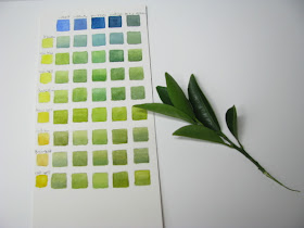
sketchbook experiments in green

This week began with the quest to find the right greens for my Calamondin orange leaves. The leaves are a dark blue-green on top, and a yellow-green underneath. I had used indigo for my earlier studies, but Indigo is like the Mariah Carey of pigments- it's such a diva! It’s a fabulous colour but it stubbornly refuses to be lifted. It muddies up all the other colours. It’s unpredictable and at times overbearing.

There was nothing for it but to find a better blue… so I made up a chart comparing  Indanthrene, Cobalt blue, Perylene green and Indigo. I mixed them with a selection of transparent yellows. I tried possible mixes over cerulean (which will be my first wash on the leaves)… but still the elusive green was not found.

By coincidence, Robert Genn’s weekly newsletter (worth signing up for if you haven’t already) was all about yellows. I was very interested to read that one of my favourite pigments, Indian Yellow, came about by feeding cows a diet of mango leaves, and then harvesting and drying the bright yellow urine. Remind me not to lick my paintbrush!! A similar colour, New Gamboge comes from the resin of the Garcinia hanburyi tree, found in Cambodia. In fact the word Gamboge comes from the word Gambogia, Latin for Cambodia. The pigment from this resin is used to dye the saffron coloured robes of Buddhist monks.

Comparing Winsor Yellow (deep), Indian Yellow and New Gamboge. I'm still sighing over the gorgeous Indigo though... look at the lovely dark it makes when mixed with sap green (second column from the right)
Inspired by this, I decided to compare the two pigments with my blues, and was surprised to find that although they look very similar on their own, the greens that they make are quite different. In fact Indanthrene and New Gamboge seem to be the answer to my green issue! Mind you, I haven’t yet put away the Indigo, so it might yet get a look in.

So onto the composition-
All traced out. I decided that I had too many leaves, so cut off a few.
 I selected three small branches of my little orange tree. I laid the sprigs onto paper to get the feel of the composition, took a photograph , and then drew each one out carefully onto a separate sheet of tracing paper. Then it’s just a matter of playing around until you get the right arrangement. As I plan to paint this onto vellum of a similar size to the Iris foetidissima, I felt that it would be nice to get a composition that would complement that of the iris. They are not a pair, but with luck, they will be both accepted into the SBA exhibition.

Laying them all side by side, helps me to envision what the final result will be
  
However I wasn't happy with the composition, and so redrew it to come up with a better one (right)
Tracing paper is such a great way of working out composition, particularly when you have more complex illustrations. You can move pieces about with ease and, if necessary, even flip images by simply turning the tracing paper over. If you use a photocopier, you can also reduce or enlarge your traced images- very handy when planning the composition of scientific botanical illustrations.

All set up and ready for action. The little bit of silver paper bounces light back up onto my fruit to give it a bit of "oomph!"

So, with my composition and the colours worked out, it’s now just a case of getting my head down and painting! I’ll try not to suck on the paintbrush though.

"They'll sell you thousands of greens. Veronese green and emerald green and cadmium green and any sort of green you like, but that particular green, never." Pablo Picasso

Saturday, 1 February 2014

Orange Appeal

 The weather this week has been dark and dismal. Even as I write this, the rain is a relentless drumbeat against my window pane accompanied by a howling biting wind, and it's set to continue. However, I really don't mind. I've a delightful dwarf citrus tree, the Calamondin orange tree (× Citrofortunella microcarpa) sitting in my studio. It's sunshine in a pot.


As Frank Sinatra said  “Orange is the happiest colour.”

I knew as soon as I saw this plant that it would be perfect for my final SBA painting. I wanted something that would work well with the other paintings that I am submitting, and this lovely little shrub with  it’s dark glossy leaves and tiny orange fruit was just the right colour, subject and size. 

So on to that crucial "Getting to know you" stage. I cleaned off my palettes and pulled out all my pencils, paper, colour charts and paints and began my studies.


I soon realised that the light, or lack of it was going to be a problem. In order to show my fruit off to it’s best, I really needed strong lighting. The light also has to be constant- it’s impossible to start in natural light and then switch to an artificial one, as the colours and shadows change too much. So given the rather bleak weather forecast (rain, rain and yet more rain), I decided that artificial lighting was my safest option.
I found a fantastic little magnifying light in Argos (LightCraft Compact Craft Light) -  the magnifier is great and the light is extremely bright and gives off no heat (so no wilting plants). It has a flexible head and best of all, it’s great value for money!


The little oranges proved a little trickier than I thought. Those dimples were challenging but essential to the texture. I tried out different techniques to see which would work best- first carefully painting around the dimples, then applying masking fluid with a toothpick, and finally adding in tiny dots of white gouache at the end. I plan to paint this on vellum so will probably opt to just paint carefully around the dimples and pick out the highlights with the tip of a scalpel.
Different techniques give different results- the two at the top (left)  were done using masking fluid, the two beneath had white gouache added at the end, whilst the ones on the right were just painted carefully.
The colours that I mainly used were indian yellow, winsor orange, winsor orange-red, pink madder (Pebeo), quin red, scarlet lake, purple lake, and of course the wonderful cobalt violet… the ideal colour for reflected light on fruit.

So many greens, but which is the right one?
The leaves were a struggle. They are dark blue on the top and a yellowy green on underneath, but I still haven’t yet figured out the right colour mix!  I used Indigo and aureolin (with a little perylene green, cerulean and green gold) in the tiny study at the top, but Indigo is a staining colour, and so not very cooperative if you make a mistake or go to dark.  A weekend of colour mixing lies ahead and then the real fun can begin. 


Next week I'll paint to the music of the rain.